Figma UI Kit Development Case Study: How Amgine Cut Time-to-Design by 50%
Highlights
- 50% reduction in time required to create new product screens through systematic component design and reusable patterns
- 28 components delivered achieving 80% UI coverage for the client's target product
- Foundation established for future design system evolution with streamlined design-to-development collaboration and flexible, adoption-ready components
Project Overview
Rangle partnered with Amgine to deliver a comprehensive UI Kit designed to enhance their design practice, enable product refresh efforts, and establish the foundation for a future design system. The engagement focused on accelerating design cycle time, systemizing critical patterns, and streamlining design-to-development collaboration.
Challenge
Through initial interviews with the client team and exploration of their product design process, several key challenges were identified.
Brand cohesion and delivering a consistent user experience were identified as top concerns across the team, with a particular need for responsive design across mobile, tablet, and desktop breakpoints. The Product and Design teams were spread thin and not always able to create in-depth direction or specifications, which meant developers spent significant cycles filling gaps around missing user flows, user interaction design, and component states. The team was also experiencing growing pains in workflow and collaborating across different roles.
From a technical perspective, there was a strong preference to continue leveraging Material UI where possible to save development time and effort. As the product was constantly evolving, flexibility in the UI Kit components was critical to ensure they could adapt to future use cases.
Solution Approach
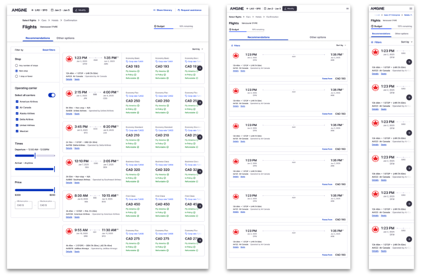
Rangle focused on delivering a UI Kit that would accelerate the current redesign process, reduce low-value rework and overhead, and be adoption-ready from Day 1. The approach centered on a design refresh of the client's traveller app as the primary focus area.
1. Strategic Planning and Component Identification
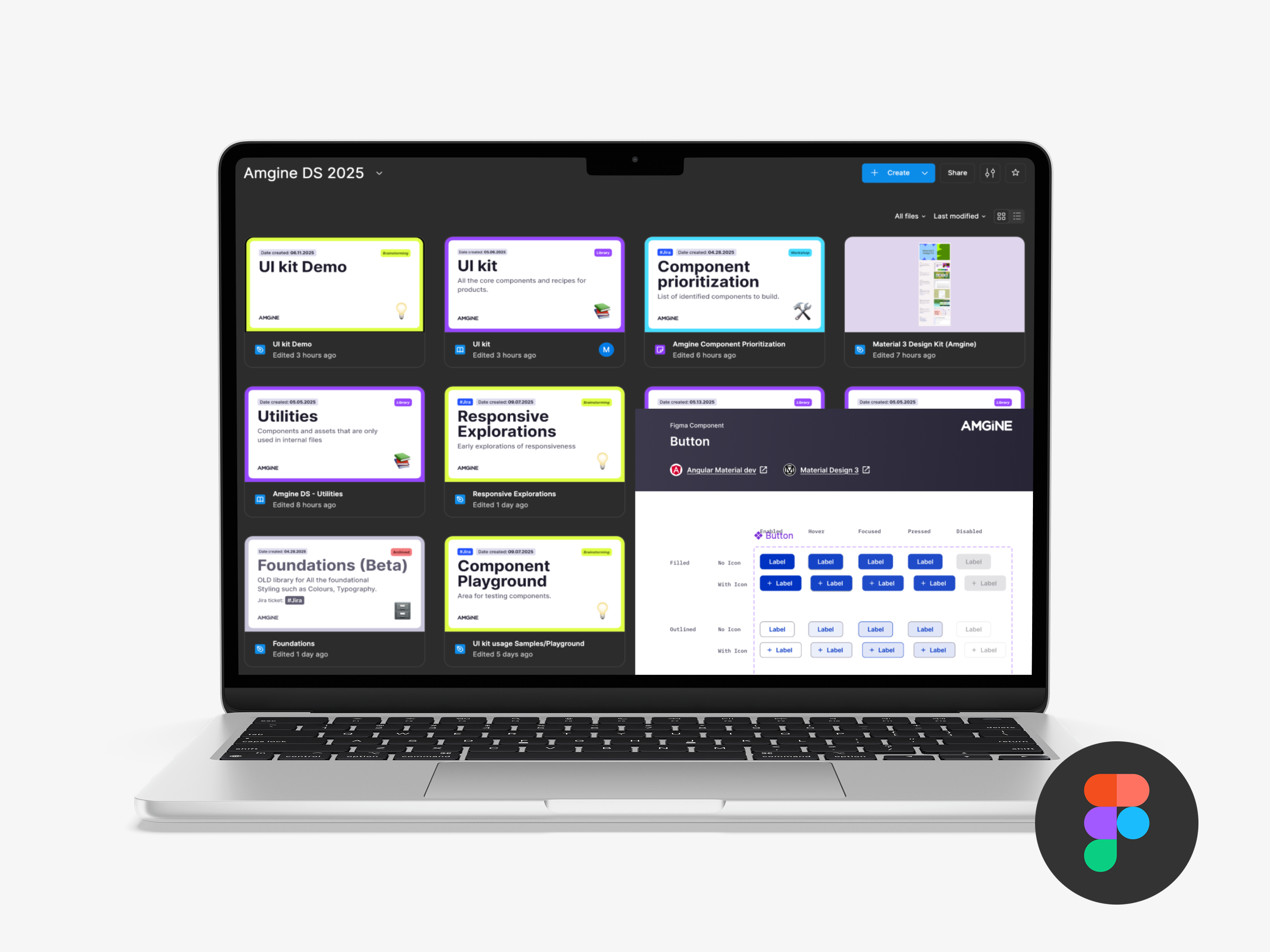
The team began by decomposing product screens into a comprehensive list of potential components and prioritizing them based on upcoming design and development work requirements to enable early adoption and feedback. They identified the constraints for the UI Kit, including Material UI tokens and components, and created a new Figma file structure and workflow. Critical to the process was establishing feedback loops with stakeholders to gather inputs, keep the team informed, and ensure alignment was maintained throughout the project.
2. Foundation Systems
The team established and stress-tested core design foundations including colors, typography, border specifications, spacing systems, shadow guidelines, grid structures, and breakpoint definitions. All foundations were documented, tokenized, and aligned with Material's token structure to ensure a straightforward development path for the engineering team.
3. Component Development
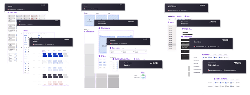
Rangle designed 28 total components comprising 19 shared components for cross-product use and 9 product-specific components for targeted functionality. All components were documented and tokenized, built to leverage Material UI where possible, and designed specifically to align Design and Development workflows.
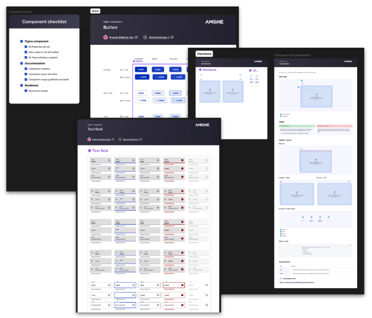
4. Documentation Strategy
The team created a lightweight component document template that balanced value with maintenance effort. Material components were linked directly to Material's comprehensive documentation, while custom components used a standardized template that included component anatomy, usage guidelines, design specifications, and accessibility guidelines. Hybrid components that combined Material UI with customizations augmented Material's existing documentation as needed.
Results and Impact
Design Efficiency Improvements
The UI Kit delivered a 50% reduction in the time required to create new product screens and significantly reduced time spent on repeated UI decisions through the implementation of reusable patterns and components. The shared visual language accelerated product design work by providing clear, consistent direction for design decisions.
Coverage and Adoptability
The project achieved 80% UI coverage for the target application and demonstrated 90% coverage across 3 updated product screens spanning desktop, tablet, and mobile breakpoints. The deliverable included comprehensive foundational elements and essential components, providing a solid foundation for future extension supported by guidance documentation.
Quality and Flexibility
Components were designed with product needs prioritized for usability and clarity, while patterns were aligned to existing product constraints to enable seamless adoption. The team built in flexibility to support evolving product experiences while maintaining a cohesive user experience across all touchpoints.
Real-World Validation
The UI Kit's effectiveness was demonstrated through the successful updating of 3 product screens across all breakpoints including desktop, tablet, and mobile. These examples showcased how the UI Kit accelerates design iteration, simplifies decision-making processes, and ensures a cohesive experience across breakpoints while covering over 90% of the chosen screen requirements.
Long-term Vision
The engagement established a strategic foundation for evolving from a UI Kit to a comprehensive Design System. This evolution encompasses enhanced team collaboration and governance, systematic adoption processes, comprehensive documentation systems, and operational excellence in design system management.
Conclusion
The UI Kit project successfully delivered a foundational system that accelerates design processes, improves user experience consistency, and establishes scalable adoption patterns. By achieving 80% UI coverage while reducing design time by 50%, the engagement demonstrates the strategic value of systematic component design in accelerating product development and ensuring consistent user experiences across platforms.