Multi-Brand Design Systems help establish a consistent brand identity across channels
Establishing a unique and cohesive brand identity is essential for businesses to stand out and succeed when customer experience matters. But the growing number of digital channels makes this a huge challenge and it's even worse for large companies with multiple brands.
The best approach to dealing with this is by establishing a multi-brand design system, a comprehensive platform that enables companies to maintain consistency across various brands, teams and channels.
When building a multi-brand design system, incorporating Figma variables can significantly enhance the efficiency and maintainability of the system. Figma variables allow designers to create dynamic and adaptable design components that can be easily customized for different brand applications. This level of flexibility not only streamlines the design workflow but also ensures consistency and coherence in brand representation.
Understanding Figma Variables
Figma variables are dynamic design elements that can be customized and reused across multiple design components. They include properties such as colours, typography styles, border radii, spacing and more. By defining variables, designers can create a master set of design attributes that can be consistently applied throughout a multi-brand design system.
A comprehensive multi-brand design system with Figma variables typically includes the following key components, based on the size of your organization and the brands living under this organization:
Multiple Brands with the Same Primitive Foundation
This structure is useful for an organization which has fewer brands under them and can benefit from having a single global foundation brand that can be used to recreate their consecutive Brands X, Y and Z.
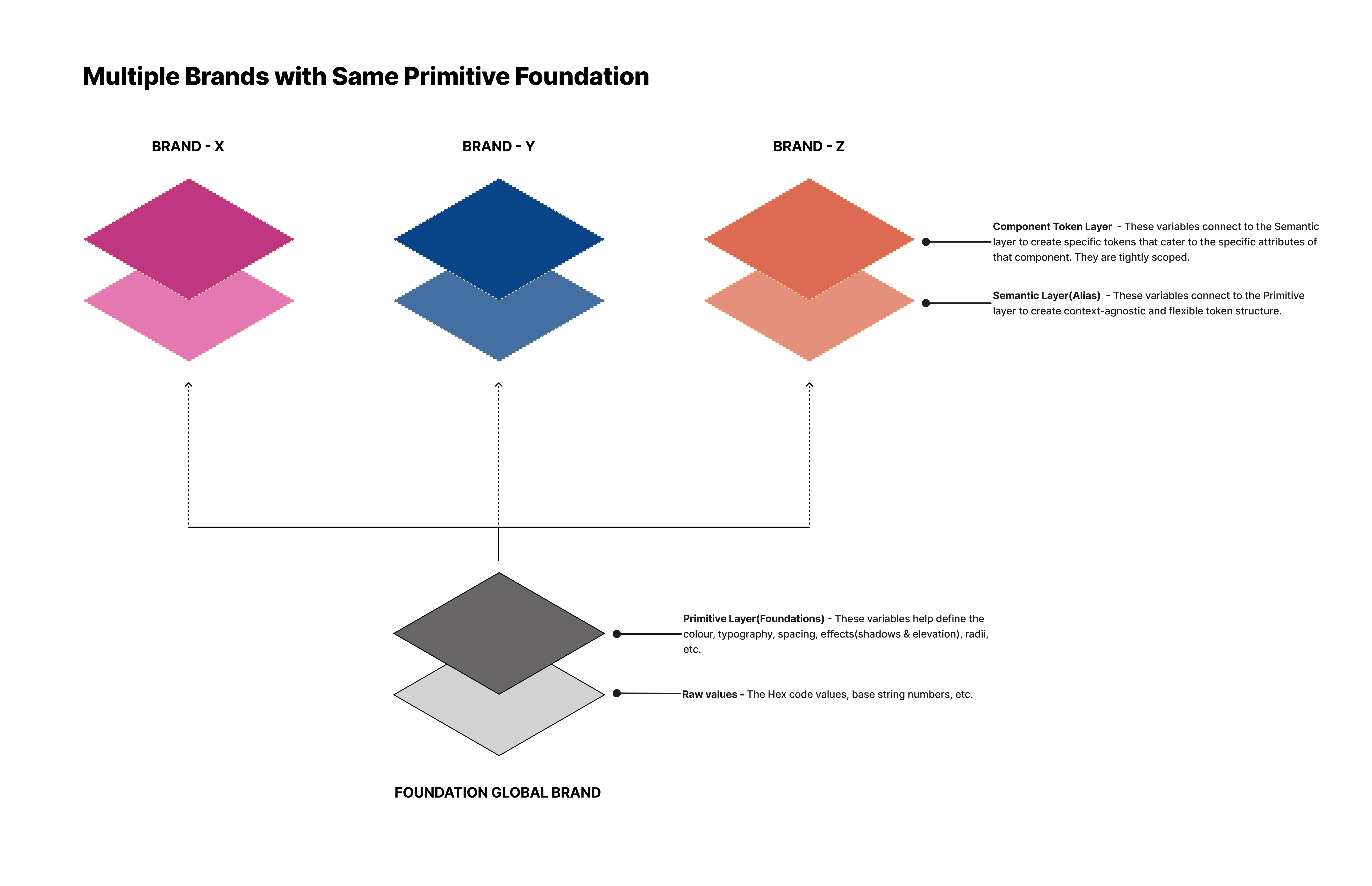
For this, we can use Figma variables to build 4 collection sets:
- Collection 1 - 'Foundations (Global Brand)': This will hold all the primitive variables for colours, typography, spacing, etc. Example: This holds values of Red from 100-500, values of Blue from 100-800, values of Yellow from 100-400 and values of Green from 200-700.

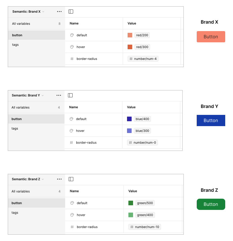
- Collection 2 - 'Semantic (Brand X)': This will use variables from the Global brand to create Brand X specific semantic tokens. Example: 'Button-Default' uses 'Red-200' as its value.
- Collection 3 - 'Semantic (Brand Y)': This will use variables from the Global brand to create Brand Y specific semantic tokens. Example: 'Button-Default' uses 'Blue-400' as its value.
- Collection 4 - 'Semantic (Brand Z)': This will use variables from the Global brand to create Brand Y specific semantic tokens. Example: 'Button-Default' uses 'Green-500' as its value.
Multiple Brands with Multiple Primitive Foundations
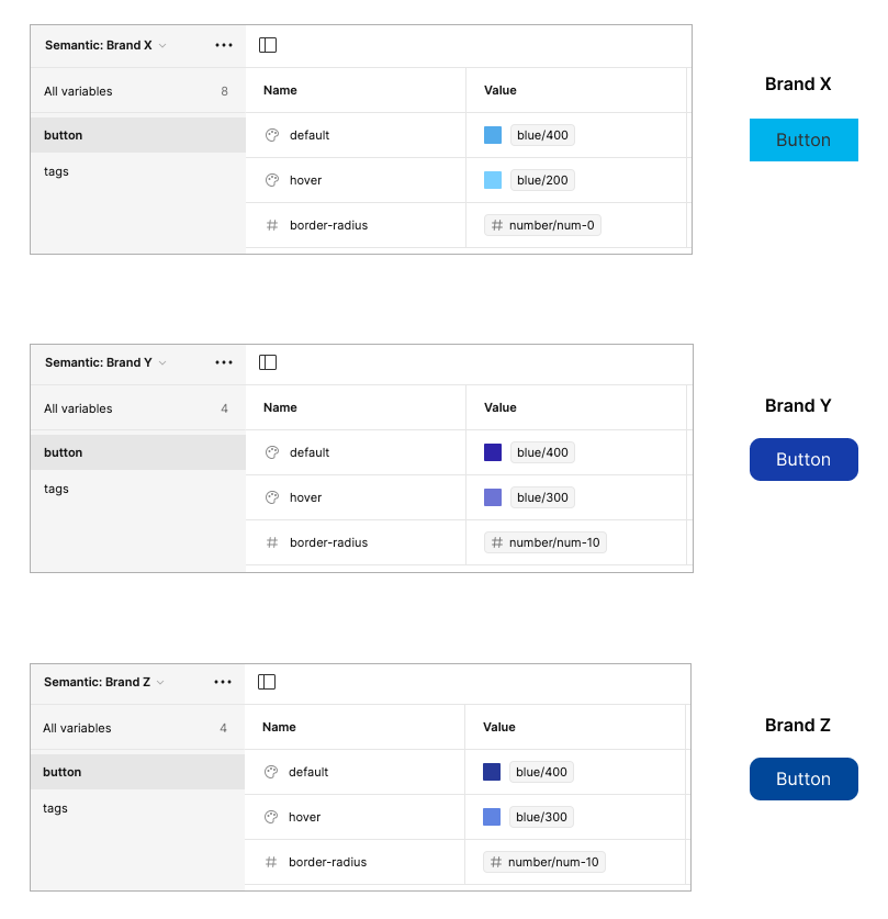
This structure is useful for a multi-bodied large-scale organization, which has multiple brands with distinct design languages that follow through. Here, multiple foundational brands X, Y and Z for their specific Brands X, Y and Z.
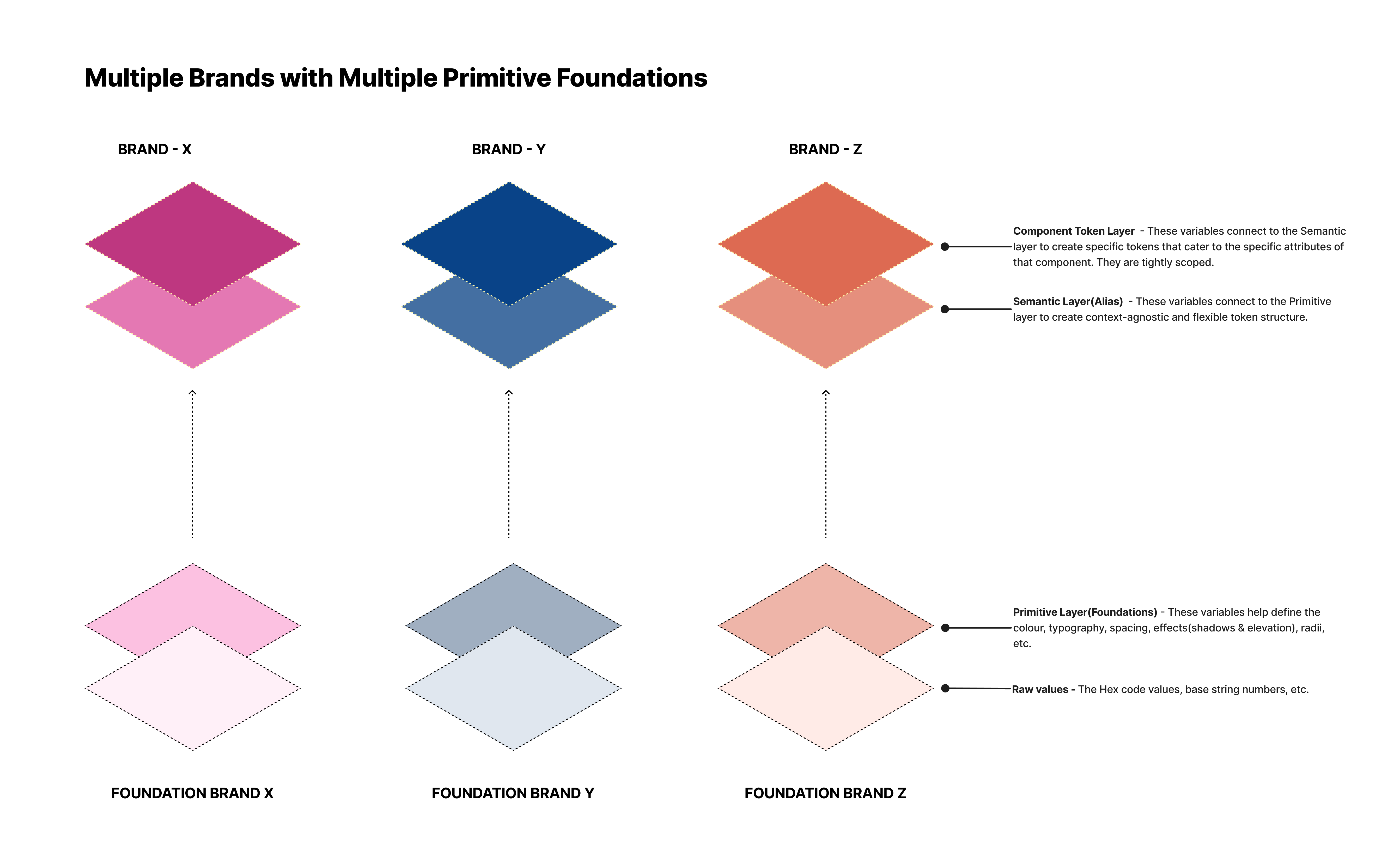
For this, we can use Figma variables to build 6 collection sets:
- Collections 1, 2 and 3 - 'Foundations (for Brands X, Y & Z)': This will hold all the primitive variables for colours, typography, spacing, etc. for each specific brand.
- Collection 4 - 'Semantic (Brand X)': This will use variables from the 'Primitive - Brand X' to create Brand X specific semantic tokens. Example: 'Button-Default' uses Blue-400' with hex value #00B3EC
- Collection 5 - 'Semantic (Brand Y)': This will use variables from the 'Primitive - Brand Y' to create Brand Y specific semantic tokens. Example: 'Button-Default' uses 'Blue-400' with hex value #153CAA
- Collection 6 - 'Semantic (Brand Z)': This will use variables from the 'Primitive - Brand Z' to create Brand Y specific semantic tokens. Example: 'Button-Default' uses 'Blue-400' with Hex value #014799
Setting Up Your Multi-Brand Design System: Key Components and Considerations
For both of these above scenarios, we would need to setup the following:
- A Centralized Library: This includes reusable UI components that can be applied across all brands, like buttons, forms, navigation bars, etc., also known as the Primitive collection.
- Brand Differentiation & Guidelines: While core components provide a foundation, the system should allow customization for each brand's visual identity. This can involve:
- Different colour palettes and fonts for each brand.
- Brand-specific variations of core components (e.g., styled buttons).
- Clear and detailed brand guidelines that define brand elements such as logos, colours, typography, imagery styles, and brand voice.
- Structure and Governance: A clear structure is needed to organize the system efficiently. Common approaches include:
- Core library: Shared components used by all brands.
- Team/Brand libraries: Brand-specific variations and components.
- Governance processes establish how the system is maintained and updated, ensuring consistency and brand adherence.
- Documentation and Training: Comprehensive documentation guides designers and developers on how to use the system effectively. Training workshops can help teams understand the system's purpose, structure, and best practices.
Advantages of using Figma Variables
To effectively manage variables across multiple brands, Figma variables creates and sets standards that are easy to understand and universally applicable. Some of the major advantages being:
- A Centralized Asset Repository: Given the complexity of multi-layered and multi-collection token structures, maintenance becomes quite complex. Figma variables allow you to define and manage styles, colours, typography, and other design properties in a centralized location. This makes it easier to maintain consistency across brands by ensuring that any changes to these core design elements are automatically propagated throughout the design system.
- Brand Customization: Designers can create brand-specific modes depending on the complexity of your design systems for variables within a library or page. This can be done by developing a token architecture layered with 3 levels: primitive, semantic and component. This helps to maintain a core identity while allowing for brand differentiation by having a solid colour system (that gives you the ability to have control over the semantics, neutrals and the accent colours, whilst keeping accessibility in mind), as well as the typography, spacing, etc. that influence the overall size of the UI elements and their tone.
Above: Switching from light to dark button variations in Figma
- Brand-Specific Overrides: Figma variables are the key to maintaining identity and theme creation. This means you can define a default set of styles and then create variations or overrides for each brand, enabling visual differentiation while maintaining a consistent foundation. Having an easy swapping, editing and changing capabilities of the variables without any additional intervention saves a lot of time. As long as the components are attached to the correct semantic token, then changes in themes and brand can be made by a simple click.
- Responsive component creation: With the power of variable modes on Figma, one can create highly responsive components that do not need additional design work. Once a single component is built with the appropriate attached variables (typography, colour, spacing, effect, etc.) and their counterparts for other breakpoints have been defined in the modes, a simple swap can create an entire component for a different breakpoint!
- Efficient Design Workflow: Figma variables eliminate the risk of manual updates which are error-prone. With an ever-evolving design language, given its centralized location, the variable changes propagate across all instances in the tokens being used in the components. This can significantly reduce the time and effort required to maintain a multi-brand design system.
- Improved Collaboration and Hand-off: Additionally, when handing off designs to developers, variables can provide a more structured and organized way to communicate design specifications, with component annotations, documentation and variables exports.
- Seamless Integration with Development: Familiar platform leads to easier training and adoption, given that both designers and developers can use this as the source of truth that holds all the tokens. The feature of cross-platform compatibility with Figma variables proves to be highly beneficial for both parties. It can be easily mapped to CSS variables or design tokens used in the development process. This facilitates a smoother transition from design to development, reducing inconsistencies and ensuring efficient implementation of the design system across multiple brands.
- Clear Organization: Figma variables can be grouped logically, making the system easier to navigate and understand, especially for large and growing design teams. Based on the multi-brand design system workflow that suits your organization, clear structural tokens can be set to make the design work easier.
- Future-Proofing: As the organization grows, newer brands can be added to the multi-brand design system built with Figma variables. The easy accommodation of changes, as well as new brands inheriting the foundational design tokens makes this a scalable and future-proof alternative. Given that variables promote a modular approach that treats components as building blocks, this makes the system adaptable and easier to expand for new brands.
- Greater Figma Community: An established community, regular Figma product updates, and Design advocates to help one understand the power of using variables in a multi-brand design system makes it a** reliable** platform.
By implementing these best practices, you can ensure consistency, collaboration, and efficiency in managing variables within your multi-brand design system.
Complexities with a Multi-Brand Design System
Managing a multi-brand design system can be a complex and challenging task. Balancing visual consistency and brand differentiation, coordinating design efforts across multiple teams, and ensuring scalability and maintenance are just a few of the hurdles that must be overcome. In addition, decision-making and governance, dependency management, frequently updating documentation, and technical considerations can pose further challenges.
- Complexity in Accommodating Multiple Brands: It is important to strike the right balance between visual consistency and brand differentiation, especially to maintain their unique design requirements and personalities of multiple brands. You will need to define clear guidelines for each brand's visual language and overall aesthetic, while ensuring a cohesive experience.
- Design Team Collaboration: Coordinating design efforts across multiple brands and ensuring alignment between design teams can be challenging. You may need to establish clear communication channels, design principles, and decision-making processes to prevent siloed efforts and inconsistencies.
- Scalability and Maintenance: As the number of brands and products grows, managing and maintaining a multi-brand design system can become increasingly complex. You'll need to establish processes for efficient component updates, documentation, and version control to ensure consistency and prevent technical debt. You'll also need to ensure everyone's using the latest version.
- Decision-Making and Governance: From the outset, it's crucial to set up a well-defined governance structure and decision-making procedure. Effective communication and streamlined process flows are essential for error-free component contributions. It's important to outline how modifications are approved, how disagreements or conflicting priorities are addressed, and how compliance with brand guidelines and design principles is ensured.
- Dependency Management: When working with multiple brands, complex brands often set the rules for the entire system. This means that even simpler brands may inherit unnecessary complexity or features they don't require, leading to potential bloat and increased maintenance overhead.
- Frequently Updating Documentation: To facilitate adoption and consistent implementation by developers across different brands, it's essential to provide clear documentation, training, and ongoing support for the design system. This will ensure that designers and developers understand and correctly apply the design system.
- Technical Considerations: Integrating a new design system with existing codebases, frameworks, and technologies used by different brands can pose technical challenges. You may need to account for compatibility issues, performance considerations, and potential refactoring or migration efforts. Choosing the right tools is important for managing a multi-brand design system.
To mitigate these challenges, it's crucial to involve cross-functional teams from the outset, establish clear processes and guidelines, prioritize documentation and training, and continuously gather feedback and iterate on the design system. Additionally, consider starting with a pilot project or phased rollout approach to identify and address potential issues early on.
Unlocking brand excellence with variable-based design systems in Figma
The strategic integration of variables in a multi-brand design system can revolutionize how businesses manage and present their brand identities. By embracing variable-based design principles, companies can achieve unparalleled flexibility, efficiency, and consistency in their brand communications.
As you embark on your journey towards optimizing your multi-brand design strategy with variables, remember to continually assess, iterate, and innovate. Embrace the power of Figma variables to unlock new levels of brand excellence and differentiation in a competitive market environment.


