A design system is a set of tools, processes, guidelines and philosophies that combine to drive how a team designs a product. The purpose of a design system is to not only systematize product development, but to also establish the processes that teams use to design, develop, test and more. As a tool, it sets the foundation for your digital experiences and products to look and feel consistent to users, increase efficiency and quality for your teams, and protect your brand across all your touchpoints in the market.
In spite of its name, a design system isn't just for designers—its purpose is to promote more and better collaboration within and across your departments.
A design system makes work flow faster, and fosters collaboration between teams. It ensures your brand standards and guidelines are maintained across all customer experiences and touchpoints, and that quality is a central part of your design and development process.
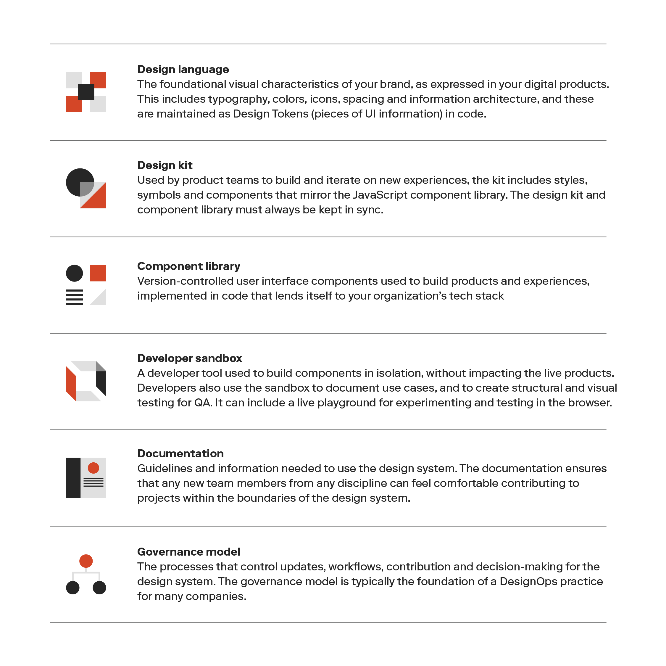
So what goes into a design system? There are commonly six parts that interconnect to make up the overall tool, and each is dependent on the others to ensure proper use and maintenance.

Let's break down these pieces in greater detail:
Design language
This foundational piece of the design system is what creates visual harmony on your site's pages, or within your app or product. The importance of this can't be overstated—the design language is often communicating more information to your end user than the actual words on the page. The trend toward simplified user experiences means that fewer words is better, so your design is saying a lot about your brand, values, information hierarchy, and how to navigate through the experience.
Consistency is key in your experiences because the design language informs your audience and helps them understand what to expect. When the rules change, it leads to confusion, contradictions, and ultimately fewer people wanting to use what you've created. When the design language is inconsistent, users feel frustration and stress, even on an unconscious level.
A design system codifies core elements of your brand like colour and typography, as well as other aspects including spacing and size, visual forms, and motion, to keep the experience intuitive and consistent. Frustration is the last thing you want anyone to feel in connection with your brand.
Design kit
The design kit operationalizes the design language. Usually maintained in a tool like Figma, the design kit allows you to create the UI library for the design system. The kit comprises the styles, symbols, and visual/UX design of the components, which map to the implementation code in the component library. In order to maintain consistency, updates to the design kit should be reflected in the component library, the code in the developer sandbox, and in the documentation, if required. Various tools can be used to automate the cascade of these changes.
Component library
The center of a design system is the component library. This is a set of building blocks for apps and webpages (including things like buttons, text links and dropdown menus) that are pre-built and ready to use when creating new experiences. A component library is also more than a style guide -- it should enable product engineers to easily add presentation elements to their product, and focus on wiring state management and business logic. These pre-built components save designers, developers and QA professionals a lot of time, letting them focus on the overall goals of the build rather than the small details of creating each element.
In an ideal design system, the component library isn't set in stone—it's updated as needed to reflect how the teams who use it are working, and new requirements for site and product builds. Version control is essential here, as is good communication to ensure component library changes are reflected in the design kit, developer sandbox, and documentation, as mentioned above.
Developer sandbox
As part of the design system's standardized tooling, the sandbox provides a place for developing components in isolation, including writing structural and visual tests. The developers can also document intended use cases for components and larger page structures, and share notes on implementation details to ensure a smooth process with less rework. The code for the component library is maintained in the developer sandbox.
Documentation
Design system documentation can be seen as the instruction manual. The documentation is a how-to guide for using the design system effectively, and ideally, tuned to the level of expertise of the team members who use it. Good documentation is also updated regularly—an out-of-date instruction manual is both frustrating and useless. The documentation not only creates shared understanding, but also a shared agreement on the design system's purpose and how to use it well.
The documentation typically includes a page for each component, describing its function, versions, use cases, areas where it should not be used, and links to related components for comparison. It also covers larger topics like the overall design elements, understanding the code framework the design system uses, and a purpose and mission statement for the design system and its implementation. Finally, ongoing documentation should include release notes for new versions of the design system, or individual pieces like component updates, including a plan for effectively communicating these updates to all teams who use the system.
Governance model
The governance model is the central control for a design system, defining and maintaining the rules for versioning, updates, the workflow, and dictating which teams or team members own decision-making authority for the whole design system.
The importance of it is easily demonstrated when a user finds an edge case that stretches the limitations of the design system.
How do they:
- extend design system components for edge cases
- submit feature requests for the design system team
- contribute to shared code and documentation and make new features available to other teams
The governance model is not "set it and forget it", but an evolving set of processes that change as the contributors, their needs, and the design system itself changes. Because of this, there is no one-size-fits-all governance model. It should reflect how your organization works to ensure it's taken seriously by all your stakeholders and practitioner teams.
Who is a design system for?
The elements of a design system can benefit organizations of any size, when scaled for their individual needs. A "full" design system is most beneficial to companies who are scaling their internal teams and core digital experiences, and risk losing sight of customer experience and centricity without centralized processes and tools. It's important to caution here that many business leaders believe their brand is solid and well-defined—therefore they don't need a design system to maintain consistency as they scale. Onboarding new teams, outsourcing design and development work offshore, or rapidly launching new products, services or arms of your company are all instances where your design identity and practices can become muddied, or evolve to suit where the brand is headed. The system is for use by everyone in your company who builds products and experiences, including third party vendors. The design system is the ongoing conversation that keeps your brand alive and salient to your customers.
However, there are businesses who will find a design system is overkill for their needs. For companies who run a marketing-heavy website, where the internal marketing team must create pages quickly for campaigns and launches, the componentized development can be a blocker. For teams testing new tech or creating proofs of concept, the up-front work of a design system can get in the way of delivering an MVP. Many companies find that a simple component library or other type of scaled-back, light design system is enough to maintain consistency and reduce the cycle of redundant work for their teams.
The value of a design system can be fully realized for companies that have, or need, multiple digital products or regionalized sites, particularly for ecommerce, and work frequently with third party or offshore vendors to build their sites. A robust design system gives them the opportunity to move faster and create consistent customer-centric experiences across platforms.

A properly-implemented design system should alleviate friction between teams, promote collaboration, and strengthen the output of everyone who contributes to your products and services. With quality built-in from the beginning, a design system also reduces risk of poor user experiences or missed release dates due to rework or recreating past work.
Most importantly, a great design system helps you save time and money, get your products and services to market faster, and frees up your teams to tackle bigger challenges. The benefits are real for organizations of every size, especially in the new remote work reality. Done well, the design system can also have a positive impact on employee engagement and retention, as it will free up your practitioners' time to focus on solving more complex and interesting business challenges—not wasting time, energy and morale building page features from scratch for every release.
Want to know more about what a design system could add to your digital transformation journey? Check out our design systems hub.


