From Adobe to Zeppelin and everything in between, how can designers create a workflow that makes it easy for us as creators to share our work with all our collaborators, and to bring a product to launch with minimal friction?
Launching digital products for real people takes a lot of work. There are a million conversations to have and even more decisions to make as we work hard to craft, test, revert — craft again to make sure we make things as easy as possible for people to use – and then, launch to the market to find out whether the hard work will pay off.
But before any of this work starts, designers need to choose their digital tools. App-based, web-based, cloud-based? There’s a lot on the market to choose from.
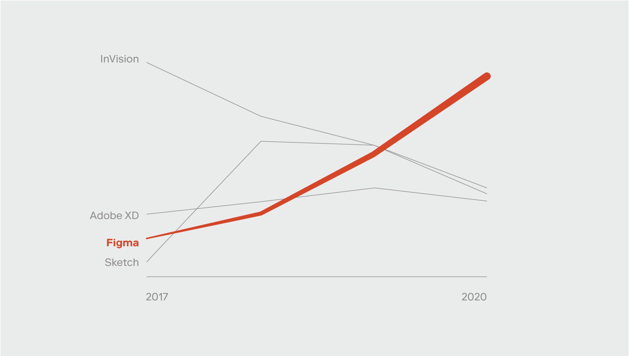
Figma allows for great collaboration unlike anything before it, which is why they’re one of our partners and one of our most-recommended tools for our clients’ design teams. Figma alone doesn’t solve all the problems of course, but it certainly allows for incredible communication between teams, accessibility from various disciplines, team and project management, and a resource-rich community that are at the forefront of digital.
In this blog, we’ll take a closer look, step-by-step, at how Figma can assist teams at every phase of a project, with a specific focus on design systems.
Step 1: Learn and discover
Often, at the beginning of a design system build, teams want to migrate to new tools to support their growing capabilities. When we’re helping our clients migrate to Figma, we remind them that it’s an opportunity to do some ‘spring cleaning’, and pitch in on the process. There may be many rogue digital artifacts — from colors to button styles – that need housekeeping. But more than that, it’s the perfect time to address how work moves through your organization. From the existing operating model to how your teams communicate, migration is an opportunity to help optimize how work flows to and from the design team.
FigJam can help your team hold workshops to identify answers, categorize, and prioritize a path forward. During discovery sessions, you’ll see how Figma features, like the multiplayer model of working, branching, team and file organization, and others can speed up your workflows. Setting up file structures and check-in points that reflect your new process is also easy, and if you get stuck, you can see how others do it. The community is large — many design systems are available in view-only formats to take inspiration from, including ours.
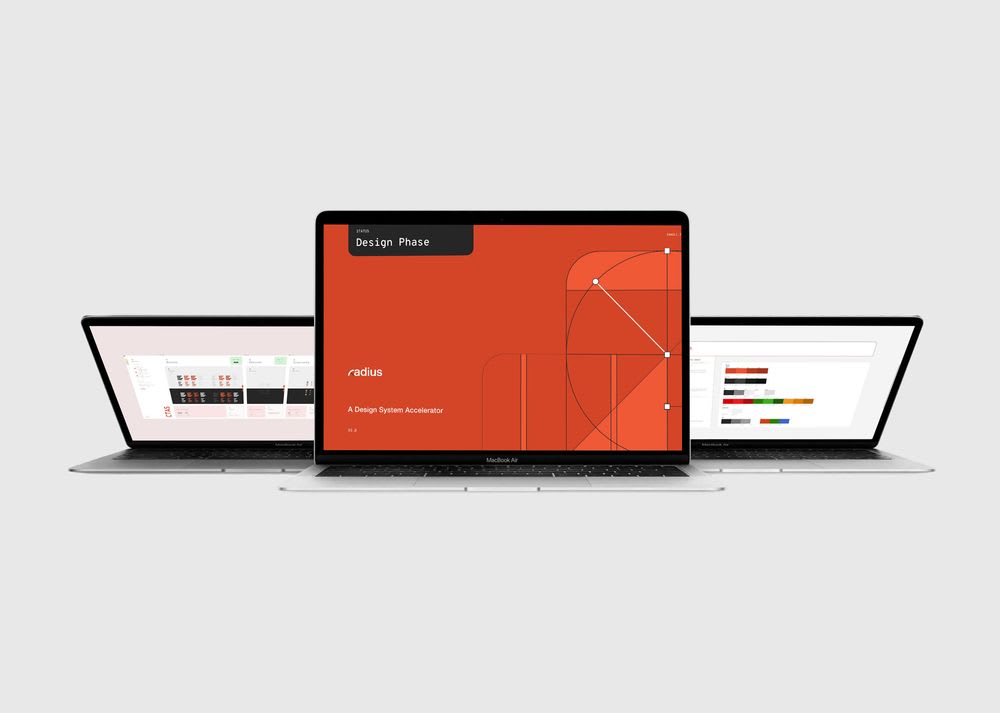
Radius: The Rangle Design System
Some teams may hesitate to take on this task at the beginning of a design system build, thinking that they can fix the problems later, or that it’s better to dive into the work first. However, we want to emphasize the importance of starting with a clean slate, and with the perspective that the workshops will uncover. This first step will require effort in the short term, but the benefits far outweigh the risks of waiting to fix mistakes later, which may be ‘baked in’ to your design system by the time you’re ready to address them.
Step 2: Align on the approach (Aka: Choose what to build first)
It may seem daunting to move an entire library over into Figma from another design tool, but starting small and building out the foundational elements is a great place to begin. Take an agile approach and incrementally build out your library; there will always be a need for iteration and fixing up how components are built. While it might be tempting to build out the whole library at once, it makes things harder to fix and maintain where changes impact more components. Taking an incremental approach to delivering these components lets you test and restructure things much faster and with less impact — which gets to the end state much faster.
The sooner you can get components in the hands of designers and developers, the quicker you can receive feedback and iterate on the components. Remember, what might work best for one team might not work at all for the other. As the main goal of a design is to communicate to the development team what to build, it’s really important to make sure their opinion is heard when building components.
Step 3: Build and code

Much of Figma's value lies in how it fosters great collaboration between designers and developers — and much of that comes from the ability to define a lot of things within Figma. Aligning with the development team on how a component could be built can help a designer understand how to structure things like variants, auto layout, and the constraints of components. Also, keeping naming structures consistent across both design and development will help with clear communication between the teams.
One powerful feature of Figma is its detailed Inspect tool for developers. It translates the variants, auto layout, and constraints into component controls and CSS. Developers can also use the custom component documentation to display things like accessibility notes or use cases, improving their understanding of the designs and how to build them.
With the wide Figma community, there are more and more plugins available, allowing you to customize your team’s setup and arm them with even more tools to get work done faster. From color contrast checkers to reorganizing and relinking files, there’s a plugin for everything. And if there isn’t, your team can build it and contribute to the open-source library.
Step 4: Building patterns

Once the design foundations and atoms are built, it's time to build out the patterns. Pattern libraries are like design systems in many ways — Libraries of UX and UI elements that are often used in your product (Navigation, carousels, filters and more can all be considered part of a pattern library). Figma is very customizable in how these can be organized and shared. They’ve even added analytics to see how many times a particular component or pattern is used. This is important for the governance of your design system so that you can assess how useful each component is, but also how useful your design system is overall. When it comes to collecting feedback from the product teams that consume the design system, the analytics act as a guide to structure questions and understand the feedback.
Figma also includes powerful prototyping features like animation (transitions and rollover states, for example) that bring design as close to the finished “product” as possible. In this way, design teams can be confident in their test results, knowing when to move forward and when to iterate on the fly. And because Figma-enabled components will be built using the latest features (ie: auto-layouts and variants), they’re responsive, so you're ready to quickly produce screens. No small consideration when modern design work seems to require a million screens for each product build!
While any new tool has a learning curve attached to it, we think that the benefits outweigh the pains of adapting. Teams can onboard faster than you think. As individual designers, learning new tools keeps our skills current, and that’s useful if you’re looking for a new role or even just to grow your portfolio of work.
Step 5: Release and iterate
Not only is Figma a great tool for design systems, but there are several DesignOps features available to help designers work smarter. Things like the design system analytics mentioned above can help provide insights on any issues with components, or the potential impacts of making changes to a component. Branching, which is a fairly new feature, allows for awesome collaboration between designers. The ability to have multiple designers working in the same file (while avoiding conflicts and formalizing an approval process) can really put a strong collaborative culture in place that strengthens team cohesion and outputs.
A note on training
One of the major parts of building a design system is onboarding. Just because you’ve built it, that doesn’t mean they’ll come. A great onboarding process is critical for all teams that will consume the design system from the very beginning, as is making sure all their requirements and processes have been addressed by what you’ve built.
When you start building your design system, you need to start thinking about onboarding at the same time. If you do your job well, you’ll account for the different disciplines that will be using the design system, and the different skill levels. Your onboarding documentation should help guide practitioners of varying degrees of knowledge. With the open nature of Figma, novice users can see file constructs, and break down components to see how they work. Clear documentation will be essential in making new teams excited to use your design system, rather than puzzling with questions.
Building a design system the right way isn’t easy. There are many considerations, decisions and hypotheticals that your team has to deal with before even the first component is complete. However, smart tooling makes the process easier, and even contributes to better team cohesion and collaboration. Even better, tools that grow with your team will make changing and iterating on your design system easier down the line. After all, a design system isn’t a static product — it’s an evolving support system for all the digital products in your company’s portfolio. With tools like Figma, your designers and developers are supported in their work, and your company is supported in the journey to becoming more agile, and releasing better products, faster.
If you’d like to learn more about our partnership with Figma, you can reach out to us with questions, comments, or to speak to our design team about the benefits of migrating to modern design tools.


