Dev Mode, a new workspace for developers in Figma, has been a game-changer for us when building design systems of any scale. In our experience, adopting Dev Mode is fully justified by the time saved streamlining the design-to-developer handoff process and significantly enhancing collaboration between teams.
In the short time we've used Dev Mode on our Design System engagements, we've already seen dramatic improvements in productivity: a 50% reduction in time for designers to document for developers and an extra 3-4 hours per week for developers to actually code. In the long term, we expect to spend less time on rework and bug fixes as the initial documentation becomes clearer with Dev Mode.
Many of our clients use the design files as a source of truth for developers but until now, missing information and miscommunication led to inefficient workflows or, worse, missed requirements in developed code. With Dev Mode, we're reducing our design and development team's effort, creating a more reliable source of truth, reducing the need for long meetings with designers, and empowering developers with new ways of leveraging the design files.
Improving efficiency
Annotations
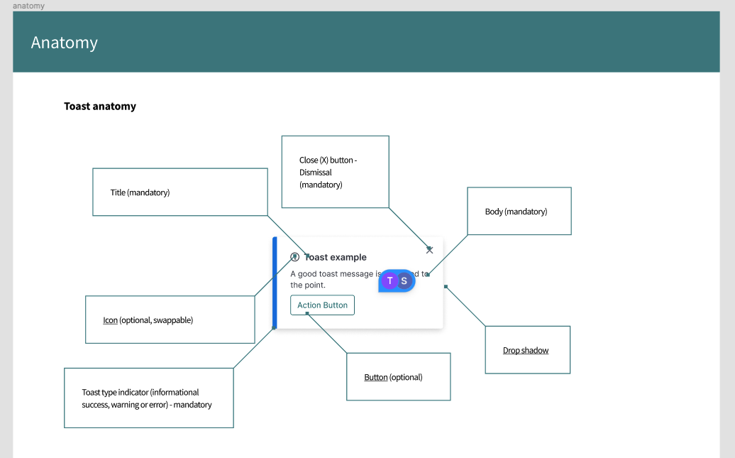
Before Dev Mode, designers used plugins and manual documentation to annotate things about components that may not have been obvious to developers, like responsive behaviors, token choices, business logic, etc. With native annotations in Dev Mode being directly linked to designs, designers now spend less time annotating design files, whether initially or as designs are updated. As a direct result, developers are able to come into a design file with confidence that the annotations are up to date and accurate.
We've found it much easier to onboard our design system clients to Figma as more crucial features to our workflow become native. This builds consistency throughout the ecosystem of design ops and allows developers to understand how designers are using Figma implicitly.
Code snippets
Generated code snippets don't always completely align with what developers create, due to the way the design team has composed the component or the CSS framework that is being used. But the code examples offer a great starting point. With Dev Mode you can quickly understand what the designer intended. For example, is an element position absolute relative to the bottom left?
Shared source of truth
Same tooling
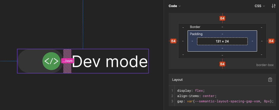
One feature that has really helped with facilitating communication between designers and developers is the translation of terms within Figma. Designers may be used to working in pixels or using autolayout to build out pages but for a developer, it may be more useful to see that pixel as a rem and autolayout as flex. This is also a huge benefit when working to create a multi platform design system. Units and terms can be translated to the specific unit that the framework works in.
Simplified workspace
Before Dev Mode, finding which values were tokens was difficult and not always obvious. The addition of local values created a more complex Figma environment. Dev Mode simplifies the creation process so developers can focus on what they need to perform their tasks.
Figma has also introduced an extension for VS Code, which not only adds the ability to interact with the designs but also adds auto-completion based on the component you have selected. This brings context to the development process where and when you need it.
Plugins
Plugins can also integrate with Dev Mode for inspection and code generation. Having a low barrier to entry for creating your own custom plugins allows you to create task-driven plugins to optimize your workflow. Depending on your project, you can even create your own custom code generation tool to structure your output precisely to what you need.
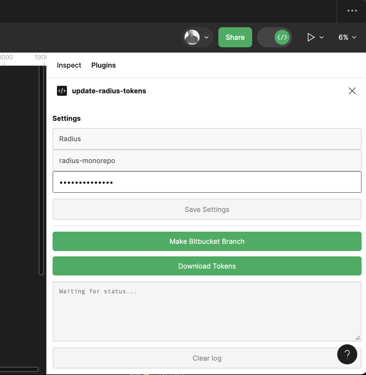
We were pleasantly surprised to discover that Figma had enabled developer plugins, allowing us to create custom plugins for environments where we may not have had write permissions. In one of our most recent projects, we automated our workflow by creating a plugin that generates a branch in our Bitbucket with variables exported from Figma. This allowed us to create a tightly knitted connection between design and development tokens, making a single source of truth in Figma.
Closing the communication gap within design & development
In support of having Figma as a single source of truth, there are many features that make the communication gap between designers and developers smaller than ever before, such as variables, "ready for development" marks, commenting and the component documentation tools. We personally use these features a lot within our process and hope you can take advantage of them as well in your team's process to improve communication between designers and developers.
Tokens & Variables
A key concept that we push for during our Design System engagements is design tokens. Design tokens are simple, reusable choices that form the visual style of a design decision. They replace fixed values, like colour codes, with easy-to-understand names. We can potentially build a complex and flexible tokens system that can adapt to any change or build a simple and strict system that can push for consistency.
Variables in Figma are our preferred choice of tool to keep and maintain design tokens. They are simple to use and integrate nicely with other Figma features. With variables, consuming teams can adopt design tokens, and teams can decide which tokens are visible to consuming product teams (often consuming teams only need access to component level tokens in a typical 3 tiered token system. We can also tie our tokens directly to components and make that information available to our developers in Dev Mode inspect.

Component documentation
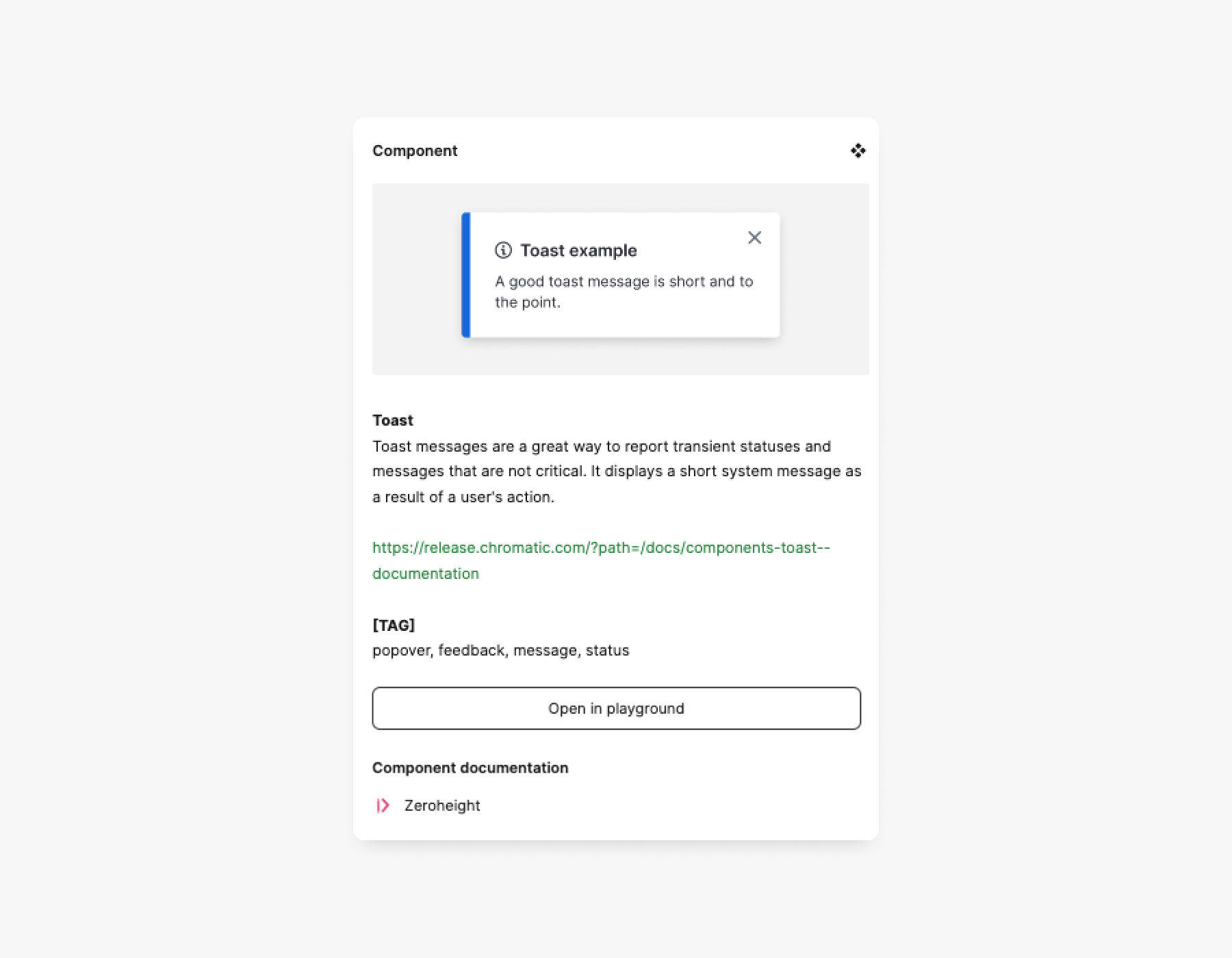
We can also add descriptions to our tokens, styles, and components to help Design System developers and consuming teams. For consuming teams, we add component usage descriptions, Storybook links, and words related to the component to help designers find and identify relevant components in the asset library.
Why worry about whether you have the latest relevant link, or comb through Slack messages to find relevant documentation, when all the information can be put front and center for all users of the library?
Ready for development
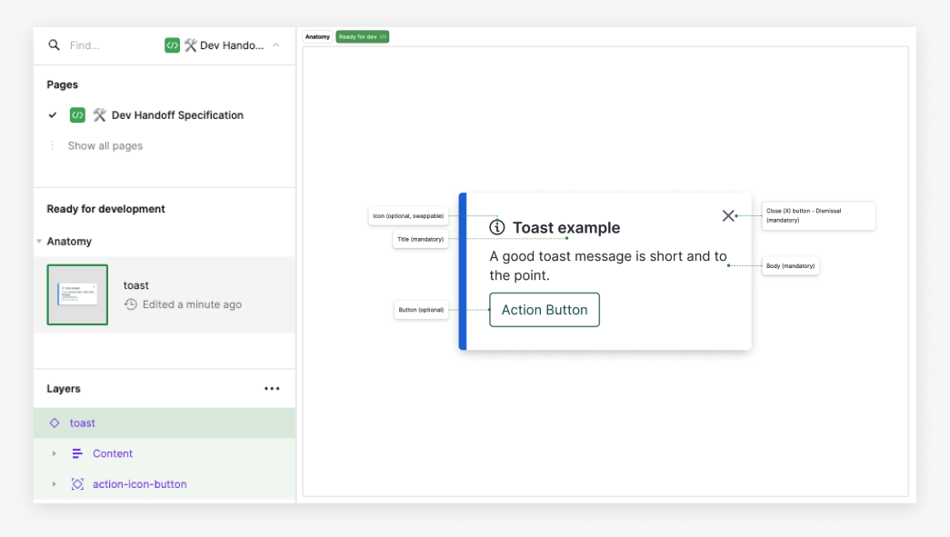
Have you ever accidentally developed a component based on unfinalized designs? It's sometimes hard to tell which parts of a component are ready for development.
Now, teams can mark assets that are ready for development using the new marking system in Dev Mode, and developers can selectively view frames that are marked "ready for development." This was always a pain to manage and communicate consistently and now it's a button click.
Comments
Despite following the design process and using Figma features to a tee, mistakes can still happen. When everyone is super busy and it's difficult to schedule meetings, we use the trusty comments feature within Figma, pointing at a specified area and have a thread going to try to resolve any issues. We encourage both developers and designers to not be afraid to have conversations with each other to align on design and technical implementation.
Another benefit of using the comments tool is that it keeps track of all historical threads within a file. This allows teams to trace back conversations and ensure there is no loss of context. Having conversations outside of Figma has the risk of context being lost across multiple tools.
This adds an additional layer of transparency between teams and enables them to work more asynchronously and efficiently.
Empowering Developers
The reduction of noise in Dev Mode, specifically showing only pertinent information, serves to refine the overall user experience for developers. This customization helps mitigate the fatigue associated with excessive information overload.
Playground
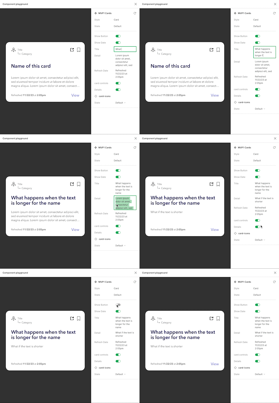
By far, the most powerful new tool in Dev Mode is the addition of Playground. It enables designers to demonstrate their component's abilities, allowing a single place to see all variants.
The superpower of Playground is its ability to switch token sets, which has been a blessing when working with multi-brand design systems. It's allowed us to preview what a component should look like when using specific tokens.
When creating components as a developer, it is time-consuming to find out how we make the component flexible or what its API is. In the past, we needed to explore the component to find these properties but Playground clarifies the intentions of the design team and simplifies the creation of component APIs.
Conclusion
As a developer, getting the information you need from a Figma design without Dev Mode is like building a bookcase without a hammer: possible, but time-consuming and immeasurably frustrating. Yes, you can glean the values you need from Design Mode if you know where to look and have infinite patience, but with the time Dev Mode saves, you could polish off four PR reviews, two bug tickets, and a blog post about floating point imprecision in JavaScript.
— Anya Craig, Developer at Rangle
While our product team is early in its exploration of Dev Mode, our Design Systems team has found it to be essential.
The efficiency improvements, aided by the integration of annotations directly linked to designs, has minimized the need for extensive documentation and third-party plugins. The simplified workspace, native token support, and the elimination of noise in the creation process contribute to a more efficient and focused development environment. The inclusion of code snippets, shared source of truth, and the innovative playground feature empower developers to grasp design intentions swiftly, fostering a deeper understanding of components and their APIs.
Figma's commitment to collaboration tools, such as comments and developer plugins, ensures a seamless and transparent exchange of ideas between design and development teams. With Figma's Dev Mode, the communication gap has narrowed, and developers are now equipped with a tool that not only enhances their workflow but also fosters a collaborative and productive development experience.


