From mockups to a multi-brand design system in 13 weeks

- Scale Design
- Design Systems
Highlights
- In 13 weeks we created a multi-brand design system that was used to build the new mobile app
- Upskilled the design and development teams on modern tooling and ways of working using Figma as a collaboration platform
- The client's mobile app won multiple awards and stands as the highest-rated application in its industry across iOS and Android
About the client
One of Canada's leading telecommunications companies was undergoing a multi-year digital transformation initiative and wanted to rebuild the experience of its customer-facing mobile app. With many sub-brands under the parent brand, a design system built on Figma was needed to improve collaboration between design and development, help them attract new talent, and improve customer loyalty and engagement for their customer-facing mobile apps.
We should have built this 3 years ago!
— Director, Design and Digital Delivery
The challenge
At a high level, the challenge for the client was figuring out how to build and maintain brand equity across multiple carrier brands. Practically, this would require creating and maintaining a consistent and cohesive digital experience across its multiple carriers, each with its own independent teams.
The client's mobile team was tasked with developing a mobile multi-brand design system across iOS and Android, while adopting Figma as their primary collaboration tool. The ambition was to have the success of the mobile app redesign serve as a model for the company's larger digital transformation effort.
Safeguarding iconic brands
No matter how many brands or products in your portfolio, you will be limited by the number of designers you have, which will always be fewer than the number of developers. In order to scale across product lines and customer segments in multiple markets, the solution will require an intentional approach.
A design system is, on the one hand, a product, but on the other hand, it is a transformative way of getting your designers and developers to work together to create on-brand, on-time and on-budget digital experiences.
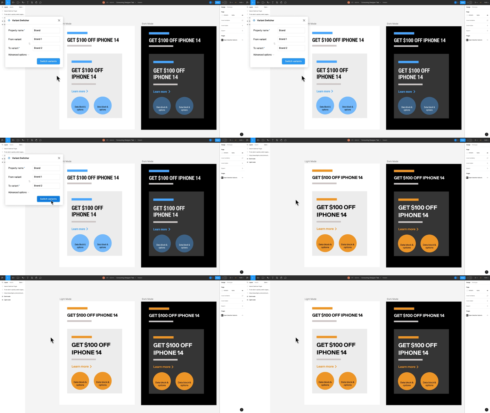
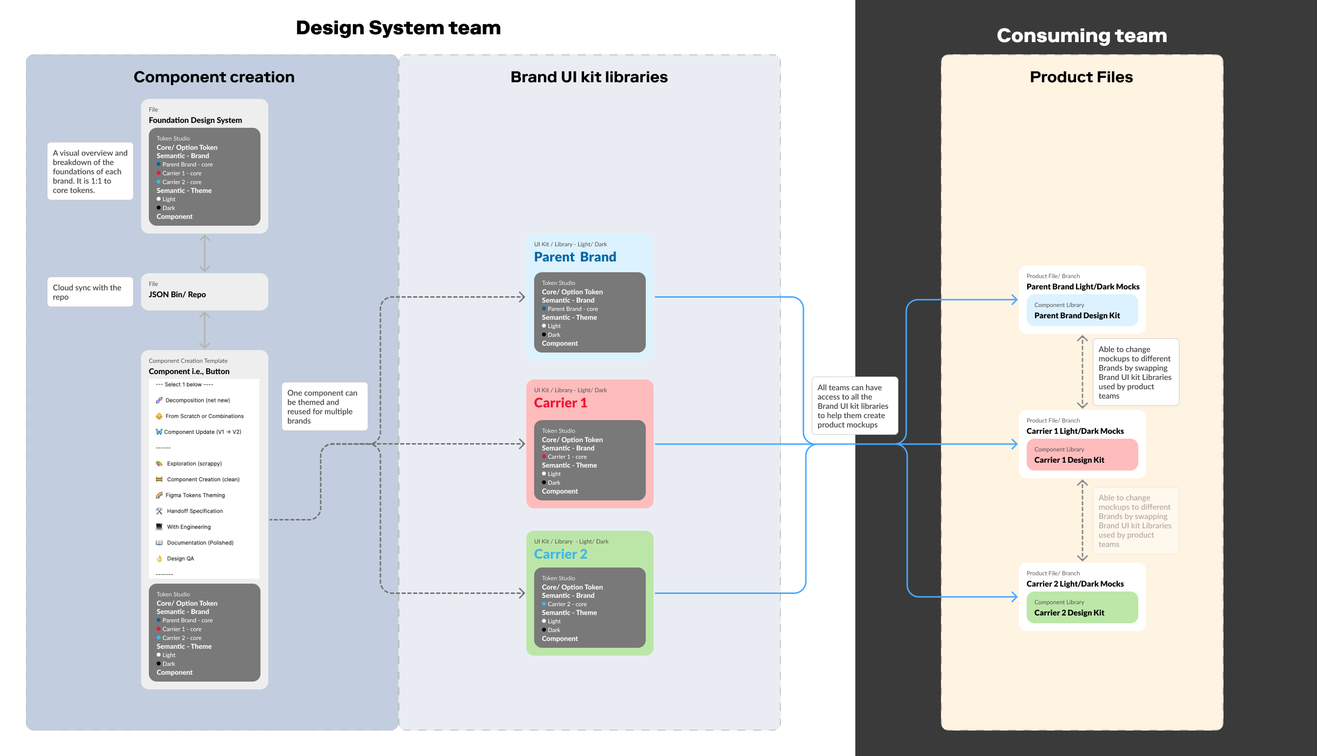
Design systems that support multiple brands are uniquely challenging and require special technical considerations, such as creating a tokens hierarchy and brand-switching workflows.

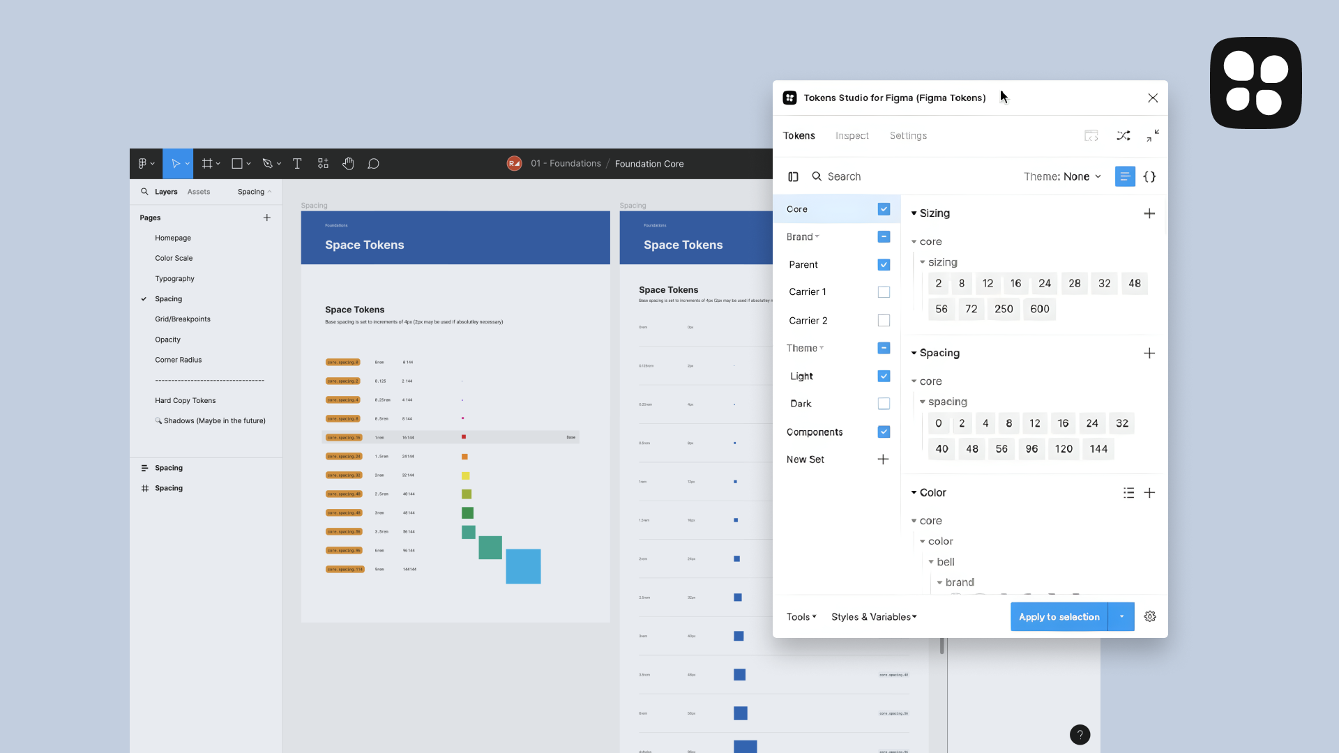
Tokenizing a design language simplifies component development and provides great flexibility for future changes. As a foundation, we implement an atomic and composable component styling architecture. Having small reusable parts that can be combined to create more complex systems is required to create flexible and scalable solutions.
In our client's case, managing multiple design contexts, such as dark mode and multiple brands, was critical. By building tokens in a three-tiered token architecture, component tokens are fixed, and contextual token switching enables the same component to be used across multiple brands. This significantly improves reusability, efficiency, and consistency, and frees designers and developers to focus on feature work.

We also worked with our client to match tokens in code, ensuring that designers and devs shared a common language, enabling faster component building with fewer defects.
Increasing efficiency and productivity at scale
The heart of a design system is how work happens between design and development.
A material challenge for the client, as for many other similarly sized organizations, is how to effectively manage communication and hand-off between teams. In the client's case, the ratio of designers to developers was heavily weighted towards developers (a common industry ratio of 1:200). This implicitly puts the onus on the design team to be more efficient, and figure out ways to achieve alignment with the developer team and ensure that everything built matches the designs.
We helped the client design empowering workflows, implement best practices, and have efficient handoff, using best-in-breed tools like Figma to support effective collaboration and better overall outcomes. Using Figma, the client's designers can now integrate design decisions directly with contextual tokens and seamlessly pass that on to developers, often eliminating the need for additional development.

No matter how good a design system is in theory, it is successful only when people use it. At Rangle, we believe in getting traction from the beginning via our learning by doing model. Throughout the build of the design system, we worked closely with the client's design team to start applying it and with the development team to start consuming it -- all the while using the resultant feedback to evolve it.
Building better user experiences
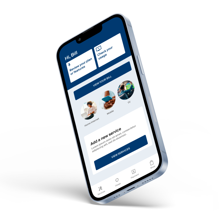
At the end of the day, the client's goal was to build great experiences, which the multi-brand design system allows it to do. In 13 weeks, we created a multi-brand design system that was used to build the new mobile app.
Building brand equity in a digital-first era means competing to have the best user experience, and the customers have spoken! The client's mobile app won multiple awards and stands as the highest-rated application in its industry across iOS and Android.
The outcome
We helped the client re-design the mobile app from scratch, while enabling dark mode and multiple brands in 13 weeks. Our design system work also served as the foundation for implementing Figma usage across the organization with most teams fully switching to Figma after the engagement ended. All of this served to maximize our client's ROI, helping them achieve their outcomes faster by streamlining application development and improving efficiency, quality and consistency.
A design system is a continually evolving product, and the client is set up to adapt as the future requires.