2 weeks to redesign Flexday's website

Highlights
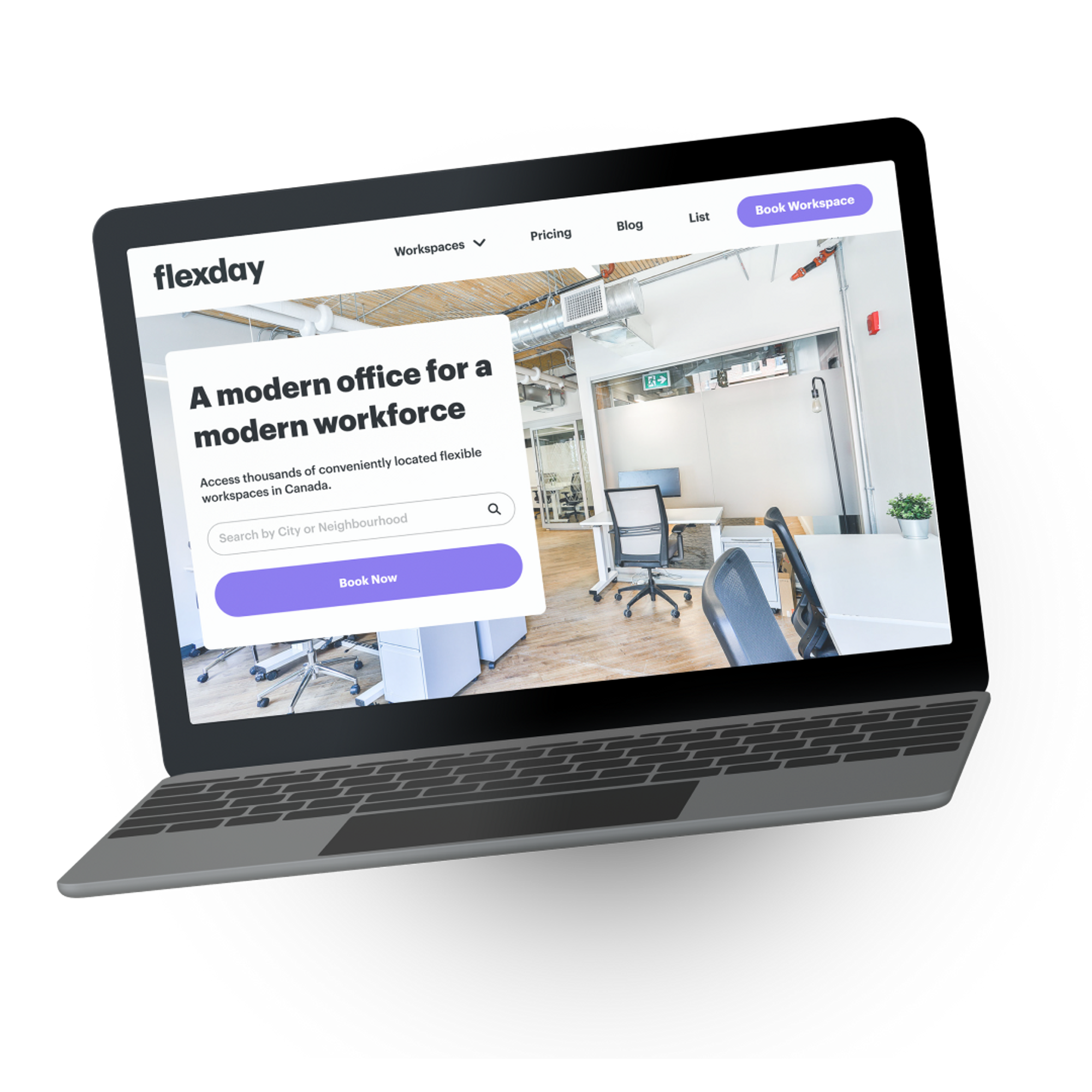
- In two weeks, we rebranded Flexday's website to be more consistent with their new mobile app
- We redesigned their web pages, including the Homepage, Workspaces, Pricing, List, and Booking Form pages with clear calls to action
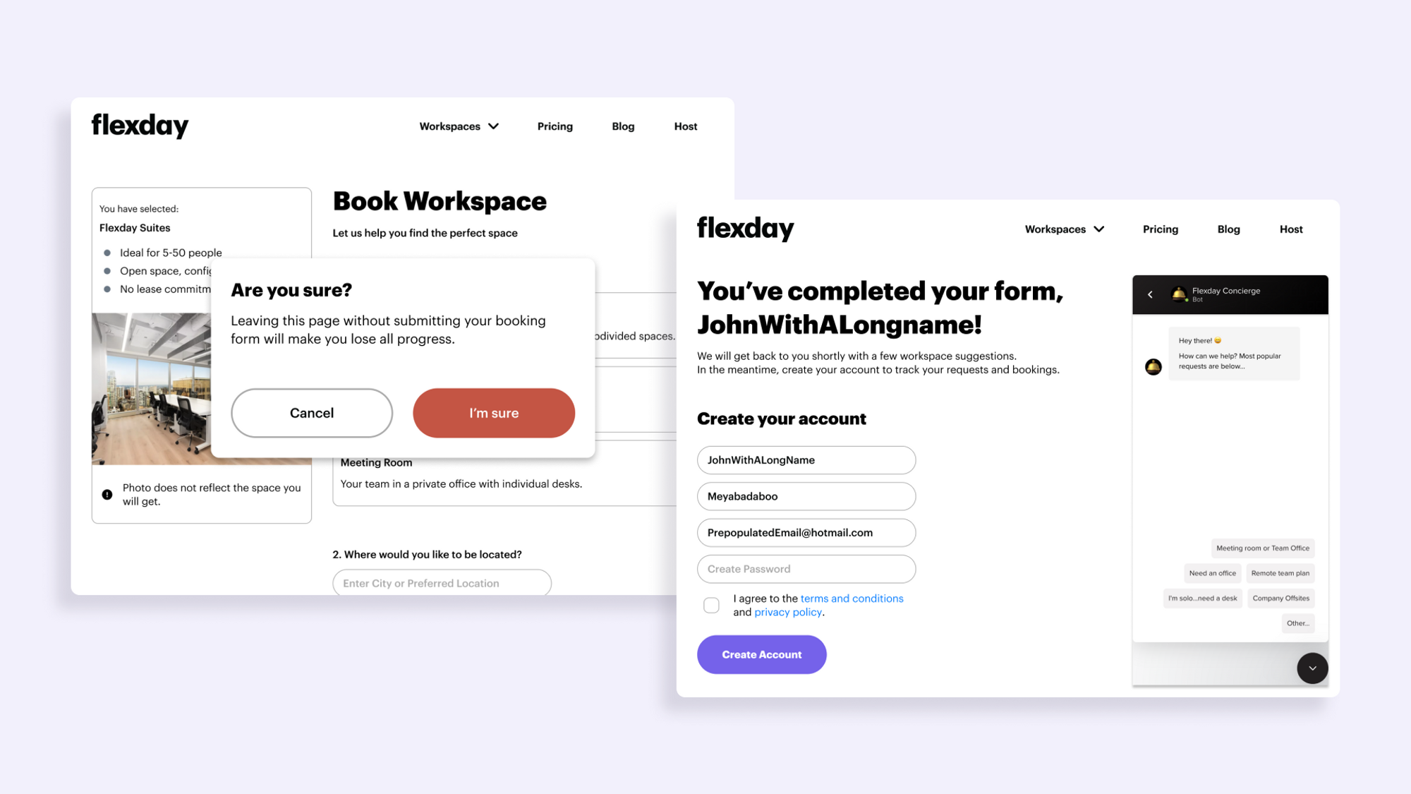
- With an improved user experience, users can now connect with the Flexday Concierge Team when booking a coworking space, increasing conversion rates
- Flexday's team can now create and edit more pages by pulling existing content blocks from the UI kit
The opportunity
Flexday partnered with Rangle to make significant and bold changes to their website. 80% of their website visitors were dropping off without performing any calls to action on the page, such as downloading the mobile app.
The objective of this two-week engagement was to understand Flexday's business goal for their website (which was to increase conversion rates of visiting users to submit workspace booking forms) and to revamp the user experience on the site to make the booking process as seamless as possible.
The process
With an extremely tight deadline of two weeks, we needed to understand Flexday's business objectives so that we could deliver value and impact for their team.
1. To understand Flexday's drop-off rates, we analyzed their website by mapping out their current user flow.
Mapping out the user flow of their current website gave us a holistic understanding of the 80% drop-off rate of website visitors. We discovered that there were too many calls to action on a single page that were competing for the visitors' attention, and it wasn't clear what each webpage's goals were -- there was a lack of prioritization with the different calls to action.
We also spent some time mapping out other competitors in the market to analyze the user flow of their websites. We brought our findings to Flexday, highlighting areas we thought their competitors were doing well in the market.
2. We aligned on Flexday's vision and mission to understand what needed to be prioritized for their website.
Understanding the client's business goals enabled us to create a better user experience for the website, as every solution we created tied back to the goal of increasing coworking space bookings. It also allowed us to prioritize what pages and features to work on within this two-week engagement so that Flexday's teams had enough material once the engagement was over to continue building on their website.
3. We proposed a variety of solutions based on wireframes of what they wanted their website to look like.
To speed up the process, Flexday's head of marketing created rough wireframes of the different pages she wanted to build. Our team analyzed the wireframes and proposed potential solutions that would work better to increase the conversion rates of their website visitors and walked them through the pros and cons of each solution to allow for a better team decision.
4. We worked closely with the team on a day-to-day basis, iterating on designs based on any technical or business concerns or constraints.
With the short timeline, we held daily meetings to ensure that we had close communication with the team and could iterate quickly in the process of designing based on feedback. Each morning, we would show them where we were in the process, walking them through our thought process behind the wireframes and designs, and having conversations about each of the different solutions so that we were able to meet our deadline.
5. We created a UI kit of reusable components that Flexday could use to create more pages in the future.
We created reusable components based on the finalized designs of the website that Flexday could use to create more web pages if needed.
The outcome

In two short weeks, we revamped Flexday's website and created new features, including:
- A more seamless Flexday location browsing experience for visitors to explore different workspace options (e.g. Flexday Suite, Private Office, Meeting Room, Coworking Desk)
- A user-friendly Concierge Booking Form with locations, date selections, and budget
Flexday's website now makes it easier for users to find and book meeting spaces or offices for their team, presenting them with a prominent call-to-action to book their coworking space when they come to the website.
With their UI kit of reusable components, Flexday can create more web pages in the future, giving them more flexibility to build their website based on their business goals.
With an improved display of Flexday's different coworking space types, users can make better decisions about what they want. Flexday users are also presented with a prominent call-to-action to book their coworking space now when they come to the website.
The Flexday team now has a design UI kit of reusable components they can use to create new pages in the future.
Need a digital roadmap?