At Rangle, we believe in sustainable development practices. This is not only reflected in our lean and agile approach to meeting our clients' needs, but also in our emphasis on individual and team happiness. We express this at the organizational level through things like communities of practice, workshops, lunch & learns, and organization-wide surveys, but also at the individual level through one-on-ones.
As a leading digital consultancy in Toronto, we know that our success is driven by our people. Ranglers are curious, brave, kind, open, and driven. When you have such a talented group of people, it's extra important to reflect on their needs, ensuring they have opportunities to grow, and are matched with appropriate projects.
Many companies experiment with ways of measuring employee health and engagement. Some use an Employee Net Promoter Score (eNPS), some use built-in survey tools in their existing employee engagement platforms, while others experiment with AI tools that measure sentiment by analyzing text or facial cues from automated check-ins.
But those things are deployed to measure employee engagement at an organizational level. What about at the team level? How do you measure team health and engagement on a specific project or program?
While we can infer team health from individual interactions and observing how the team works together, those conclusions can be highly subjective. It's important to complement that with a more objective measure. After all, happy team members likely means higher performing teams, and higher performing teams are likely to result in better retention of individuals, teams, and even clients.
Using eNPS at the team level
We have tried using eNPS to measure health and engagement at the team level. This consisted of surveying team members on a regular cadence (for example, once every two weeks) with one question:
"How likely is it that you would recommend your project to a friend or acquaintance?"
Team members responded with a rating between 1-10. The overall team score was then calculated in a way that is unique to NPS. Individual ratings of 7 and 8 were considered neutral, 1-6 were considered "detractors", and 9 and 10 were considered "promoters". The overall team score was then calculated by ignoring neutrals and subtracting the percentage of detractors from the percentage of promoters. The final score would range from -100 (the worst), to 0, to +100 (perfect). Anything above 0 was a positive result.
The challenges with eNPS
Interpreting the numbers
We experimented with this approach internally on all of our client engagements. While it was great that we were trying to measure team health and engagement in some way, we ran into challenges while relying on eNPS methodology.
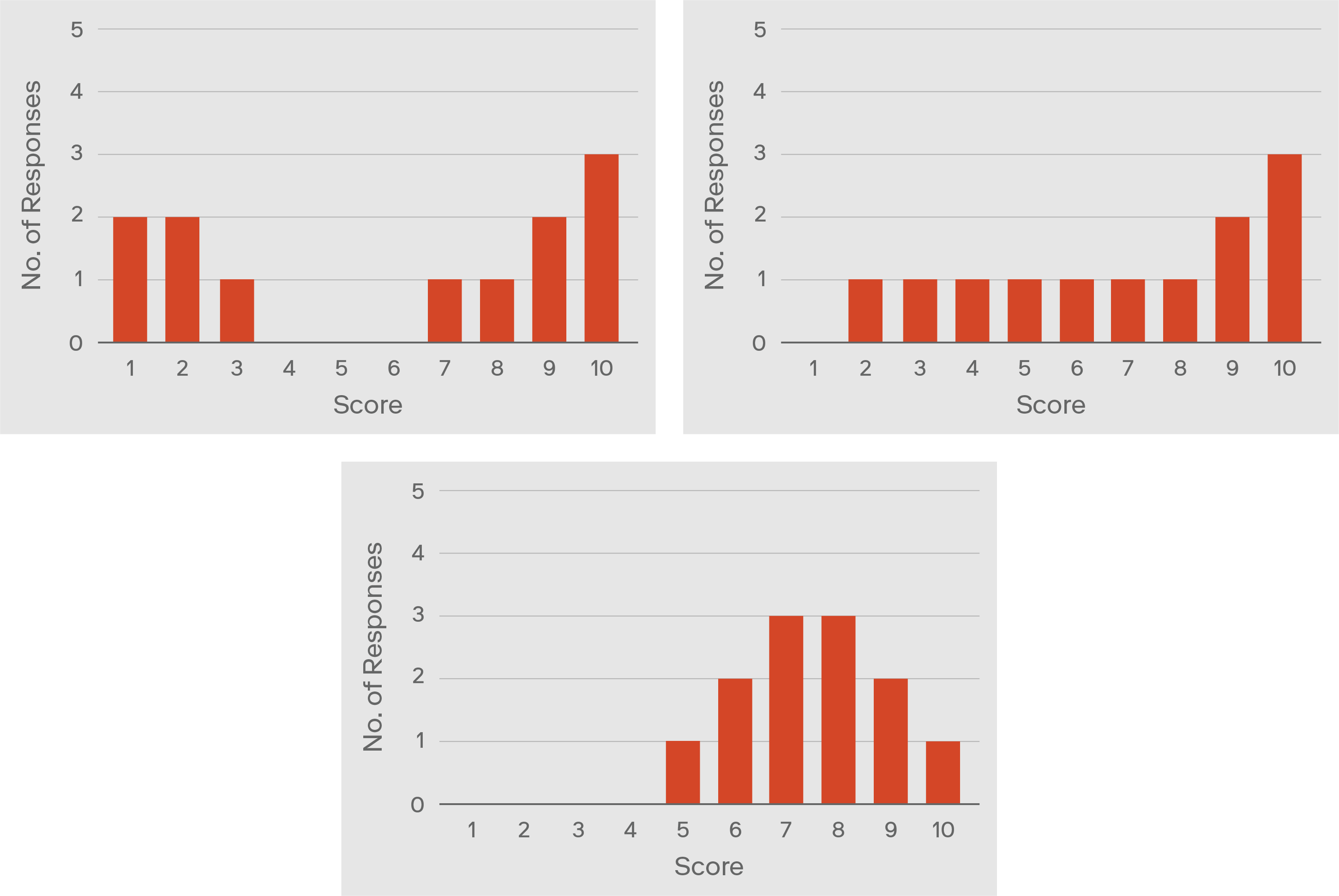
For one, the team scores were hard to interpret. Take the below examples. What do these raw eNPS responses below have in common?

The eNPS score for all three of the above teams is -100, which is the worst score possible in eNPS methodology. And yet, a strong argument can be made that these three teams are very different. Just not according to eNPS.
Then we have these examples:

Here, all three teams also end up with the exact same eNPS score. This time, it's 0. And yet again, one can argue that these three teams are probably not comparable. But eNPS says they're all the same.
So if we can end up with situations like the above, how can we possibly notice any incremental improvements in team health and engagement based on the eNPS score alone?
As the above examples demonstrate, eNPS's statistical approach is deeply flawed and hence makes any interpretation problematic.
Are we asking the right question?
But there's an even more fundamental challenge with the eNPS approach. Is it actually asking the right question to begin with? If it's asking the wrong question, then the score (regardless of how it's calculated) is meaningless.
The creators of NPS (on which eNPS is based) found from their own research that the "recommend"-type question was the best predictor of customer loyalty. But can that argument really be applied to team members on a project? Individual happiness at work, and on a specific team and project, is complicated. There are many variables that can affect our happiness with our work, our projects, and our teams. These variables can change day-to-day, week-to-week. Sometimes, we might not even be able to pinpoint the main source of our frustration.
If that's the case, then is it right to rely on one question that asks team members if they would recommend their project to a friend or acquaintance? Does that question truly capture all the variables and nuance needed to understand someone's individual experience on a project?
And when an individual team member responds to that question with a 6, what does that mean? What does a 1 mean? What does a 9 mean? Is your 9 the same as my 7?
The only correct answer is: we don't actually know.
These challenges with using eNPS to measure team health and engagement ultimately led to results that were not insightful or actionable to us. And when you ask anyone what the biggest frustration is with surveys, one of the most common answers will be: a lack of action on results. But when you can't effectively interpret the results, how can you possibly action any of them?
Our new approach: The PTAR framework
We thought it was time to experiment with a different approach to measuring team health and engagement. Something that was more insightful and – more importantly – actionable. And the only way to achieve that would be to carefully consider the typical areas of satisfaction and dissatisfaction on a team engagement, then design a survey that targets those areas and can be applied to virtually any project.
We came up with the following program engagement survey framework, which we call the PTAR Framework. Why PTAR? Because, hey, it's tech! You gotta have acronyms and frameworks… and we couldn't think of a catchier-sounding one.
The Four Domains
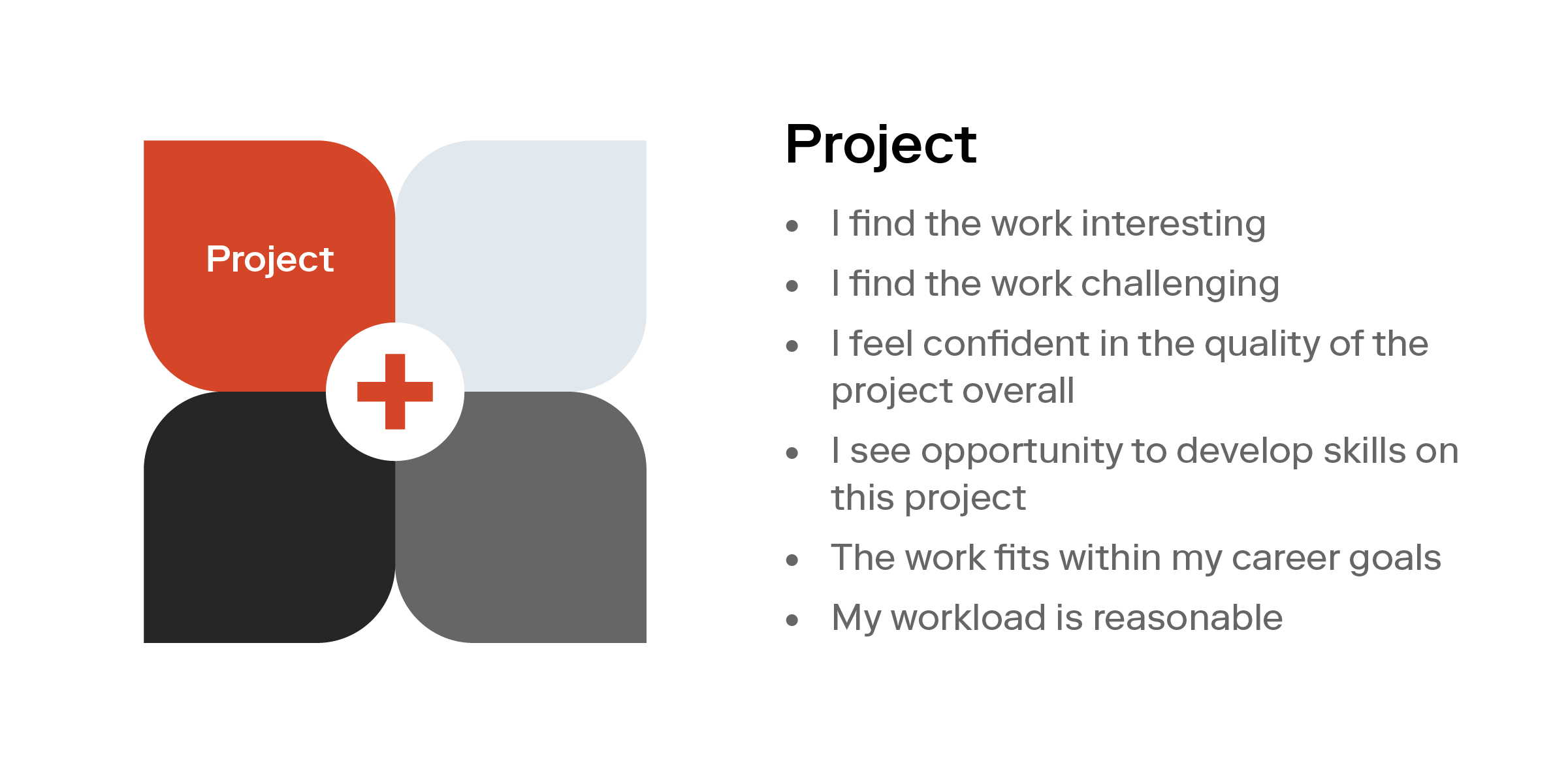
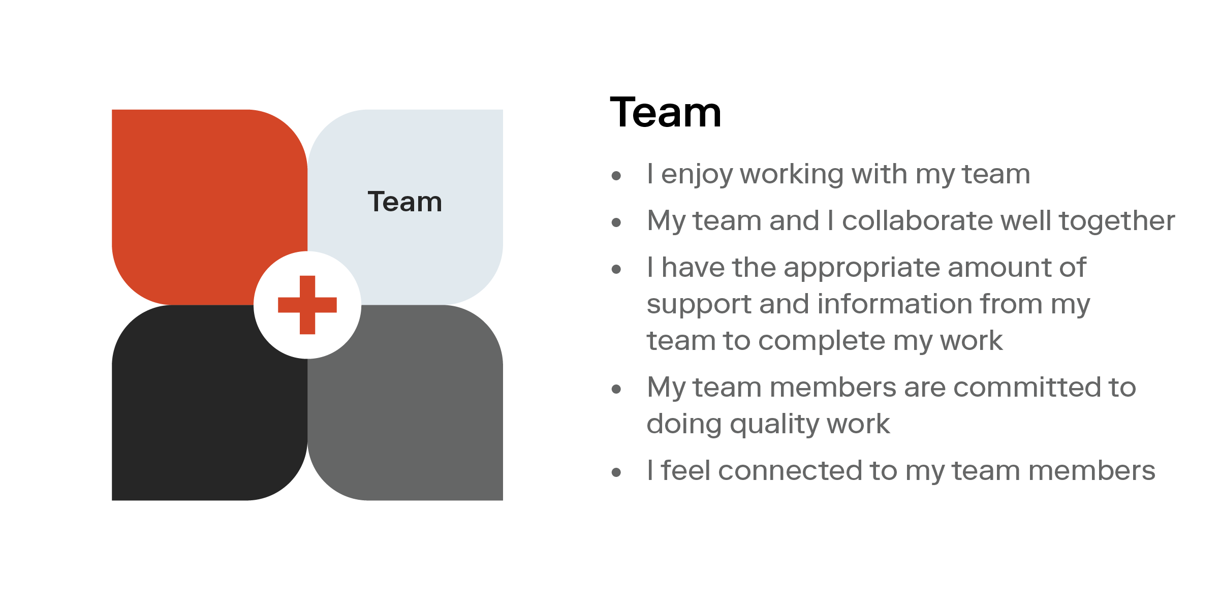
The survey covers the four domains of a client engagement: Project, Team, Account, and Recognition (PTAR).
Each of these four domains contain 2-6 statements, all measuring different sources of satisfaction and dissatisfaction within that domain. Each of these statements uses the Likert scale to allow a team member to indicate whether they Strongly Disagree, Disagree, Are Neutral, Agree, or Strongly Agree with the statement.


Each of the four domains also has an optional field (not shown above) to capture any text comments, if a team member feels like elaborating. But without adding optional text comments, the above survey takes under five minutes to complete.
Is it as quick to answer as eNPS? No. But since we deploy this once every 4-6 weeks (instead of every 2 weeks as we did with eNPS), it actually ends up being the same amount of effort overall, but with much more actionable insights.
The Results
Our program engagement survey results in two different charts.
The top chart is a rolled up, high level summary showing the ratio of 1s and 2s (disagree), 3s (neutral), and 4s and 5s (agree). This summary is what we share in internal management meetings when we meet to review the current status of all programs company-wide. At a quick glance, the results can pinpoint how the team, as a whole, feels about the four domains.


The bottom chart is the one we share with team members' managers to help them with their own 1:1s. We also share this in a discussion session with the team themselves. Sharing this chart with the team themselves is important for a few reasons, so that:
- Results don't disappear into a management black hole, never to be seen again
- To build transparency and trust with the team
- To empower the team to have honest conversations about how to make everyone's experience better
Action, Action, Action
While fancy charts and discussions are great, the most important thing is action.
Once we've met with the team to discuss the survey results together, we all generate suggestions for things we can try to do to positively impact team health and engagement. Then the team votes on only one thing to try prior to the next survey. Not ten. Not five. Just one small, achievable thing, so that this doesn't turn into another list of tasks on top of everyone's existing work. Then we keep this one thing at the forefront and apply that change as soon as possible.
So far, only a few months into this new approach, we've seen some success. Insightful results, constructive team conversations, and small actions that help move the needle. We'll continue to try this new approach on more programs and as we do, we'll generate more insights into how to help support high performing teams.
There are always flaws
No survey design is perfect, however. We're aware that this survey also has its own flaws. Several that come to mind are similar to any survey that involves self-reporting:
- The order and wording of statements
- Various cognitive biases (eg. agreement bias, recency bias, response bias to name a few)
- Assumptions about the importance of statements (just because a statement is part of the survey, doesn't mean it's actually important to everyone)
- Survey fatigue (quickest way to cause this is by doing surveys that don't result in transparency or action)
- Psychological safety
The last point above is especially critical. If there's no or low psychological safety, the team may have concerns with filling out the survey, and/or discussing the results together. But even that in itself gives everyone an important realization to act on. Ignoring it won't fix anything.
If you're not currently getting useful insights from your existing team health and engagement methods, or you're not measuring team health and engagement at all, consider trying our PTAR framework and evolving it to your needs. We'd love to hear your experiences with it.


