You need some dropdown boxes for your next React project. What do you do? Do you build your own from scratch or do you leverage a UI component framework? In the realm of React UI Component Frameworks, there are lots of popular options: React-Bootstrap , Material-UI, the open source project Blueprint, and Semantic UI React. These frameworks are great in that the learning curve is low and the time to get a dropdown box into your site is quick. But what if you need the dropdown box to match your brand, display customized error messages, or with selection items inside a speech bubble coming out of a penguin?
Although most UI component frameworks do allow some customization, it would be difficult and potentially impossible to get a highly customizable UI. While you can make a dropdown from scratch, it will take a long time to incorporate state management, managing user interactions, writing unit tests, and making it fully accessible. Additionally, making it fully WAI-ARIA compliant can be a whole task on its own since it would include things like announcing the number of available suggestions in the dropdown menu to the screen reader users, being able to traverse the items list with up and down arrows, being able to select an item with an enter key or close the menu with an Esc key.
Here is where Downshift comes to the rescue. On a recent project, one of the requirements was to build custom dropdown components. Luckily, one of my colleagues introduced me to Downshift and it saved us from having to build each variation of dropdown components from scratch while realizing the design team's vision. What Downshift gives you is the ability to have complete control of the UI for your input/dropdown/autocomplete/select component while taking care of the heavy lifting of managing state, user interactions, and accessibility for you.
Downshift is also fully tested so it will save you the time of writing unit tests. The use of render prop is at the core of Downshift so if you are not familiar with render prop, take a look at this great blog post by Michael Jackson that explains in detail what render prop is along with a few examples. Before version 2.0 of Downshift, you would pass the function that generated code for the input component UI into a render prop but since 2.0 came out, that is no longer supported. Now the function that generates the code for the input component UI must be passed in as the children to the Downshift component.
<Downshift>
{
   (downshiftProps) => {
     return (
       //you custom UI code goes here
     );
   }
 }
</Downshift>
Or if you rather use the render prop pattern:
<Downshift
 children={
   (downshiftProps) => {
     return (
       //you custom UI code goes here
     );
   }
 }
/>
Let's take a look at an example of how to use Downshift to make a basic dropdown box. I've used styled-components in my examples to provide visual styles.
The main components of this dropdown are: a label, an input, a menu and the menu items. If you look inside the code returned by the children function, you will find a very generic looking code that you would write if you were writing a dropdown from scratch if you ignore the props that are passed into the components.
<div>
<Label {...getLabelProps()}>Simple Dropdown</Label>
<Input>
<input
readOnly={true}
placeholder="Please select"
{...getInputProps()}
/>
<button {...getToggleButtonProps()}>></button>
</Input>
{isOpen ? (
<Menu {...getMenuProps()}>
{items.map((item, index) => (
<Items
highlighted={highlightedIndex === index}
selected={selectedItem === item}
{...getItemProps({
key: item,
            index,
            item
})}
>
{item}
</Items>
))}
</Menu>
) : null}
</div>
The key to hooking up your components to Downshift is the passing in of Downshift props into your components. The Downshift props that are passed into this simple dropdown are:
(getInputProps,
  getItemProps,
  getLabelProps,
  getMenuProps,
  getToggleButtonProps,
  isOpen,
  highlightedIndex,
  selectedItem);
Depending on the complexity of your dropdown and the control you want over the functionality, you can pick and choose which props you need to use in your components. The must-have props are the prop getters for each component. For example, for your input component, you must pass in ...getInputProps() in order for your input component to get the keyboard interactions such as opening the menu on pressing of the arrow keys and the aria tags needed for accessibility. The prop getters also hook up your components so that for example, the toggle button can work with the menu to allow the users to select an item and then display the selected item in the input.
In order to control the UI of your component, you will want to pass in some Downshift props that indicate the internal state of the Downshift component. In this example, isOpen is a Boolean value that will tell you whether or not the menu was called to open or close. isOpen is used to determine whether or not the menu should be displayed in this case. The highlightedIndex prop will give you an integer index of the item that is currently highlighted by the user. In this example, I've used this prop to change the background colour of the highlighted item and the selectedItem prop will indicate the item in your array of items that has been selected by the user. This prop is used to change the background colour of the item to indicate that it has been selected by the user.
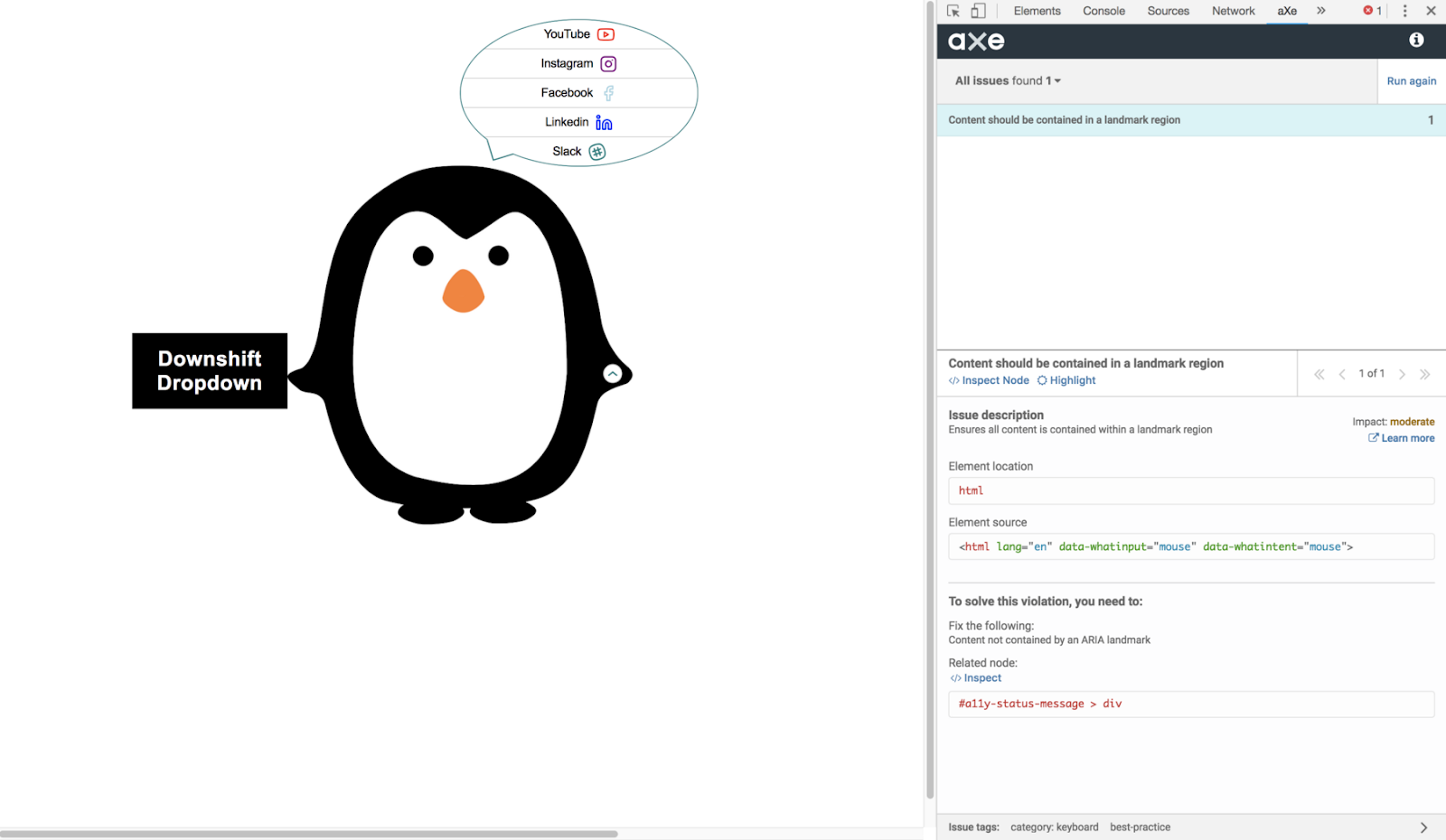
The simple dropdown box doesn't fully express the power of Downshift. In order to really showcase Downshift's customizability and flexibility, I've made an unconventional dropdown box with selection items inside a speech bubble coming out of a penguin in CodeSandbox. You can also get access to the code on my GitHub here.
There are a few other major features of Downshift that I would like to highlight using the unconventional dropdown example:
Make your own UI
I've decided to make a menu that looks like a dialogue bubble using some CSS and styled-components. For the menu items, I wanted to display more than just the text of the item so I used render props to render each selection item in order to add custom icons. You can make the toggle button, input, and label any shape you want as well! Another great benefit of using Downshift is that you can position your components anywhere. You won't need to pass in props to make the label bottom aligned like when you are using a UI framework. You can align your components using plain old CSS. In this case, I've decided to move the ToggleButton into the right hand of the penguin.
Add/Modify component functionality by using prop getters
Downshift provides you with various prop getters for different components of the input component. I decided to not use a button element as my ToggleButton, but instead use a div with an image inside it. To get all the functionality of a Downshift toggle button, I had to spread the props object returned from the use of the prop getter function getToggleButtonProps() into my ToggleButton component. By using the prop getter, Downshift will give your component access to all the props that will control the component as well as any accessibility tags required. For example, although I did not include an onClick or a keyPress prop for my ToggleButton, my ToggleButton has the functionality of opening the dropdown menu on click and I'm able to use my arrow keys to move up and down through the selection list. That's the heavy lifting that Downshift does for you!
export const ToggleButton = (props) => {
  const { isOpen, getToggleButtonProps } = props;

  const arrowIcon = isOpen ? ChevronUp : ChevronDown;
  const altText = isOpen ? "Close" : "Open";

  return (
    <ToggleButtonContainer tabIndex="0" {...getToggleButtonProps()}>
      <ToggleButtonImg
        src={arrowIcon}
        alt={altText}
        id={`togglebutton-${altText}`}
      />
    </ToggleButtonContainer>
  );
};
You are also able to add, overwrite, or prevent downshift's default actions for each component by passing in your own prop inside the prop getter. So if you want to display a message to the user when the user clicks on the ToggleButton and then delay the opening of the dropdown menu or not open it at all, you can!
If you are wondering why Downshift uses prop getters instead of spreading prop objects to the component, see how Kent Dodd (the main contributor of Downshift) explains it.
Modify the states of the component by using Downshift actions
Another feature of Downshift is that it allows you to modify the built-in functionality of the input as well. In this example, I've added a component called SelectOnKeyPressContainer in order to allow the user to highlight the first occurring item that starts with the key they press. This is accomplished by calling the downshift action function setHighlightedIndex() to set the state of the highlightedIndex. Setting state inside a render function can trigger an infinite loop. In order to avoid this, I made a SelectOnKeyPressContainer component and passed in the Downshift props and the render function of the dropdown component as its children.
const CustomDropdown = (props) => {
  const { ...restProps } = props;
  return (
    <Downshift {...props.downShiftProps}>
      {(downshiftProps) => {
        return (
          <div>
            <SelectOnKeyPressContainer
              items={props.items}
              itemToString={props.downShiftProps.itemToString}
              downshiftProps={downshiftProps}
              children={render(restProps)(downshiftProps)}
            />
          </div>
        );
      }}
    </Downshift>
  );
};

export default CustomDropdown;
Accessibility — WAI-ARIA Compliant
The contributors of Downshift definitely had accessibility in mind when making this library. Accessibility features include aria tags, voice over that tells you how many items are in your dropdown box, voice over for each dropdown box item and keyboard navigation for the dropdown box. By applying the appropriate prop getters from Downshift, your UI components will receive the appropriate aria tags. I analyzed my dropdown box with the aXe chrome plugin and the results are great. Aside from having one non-critical issue, everything else passed the aXe analysis.
Although Downshift has a steeper learning curve than using a UI framework, it is also much more powerful in creating custom input components. So next time you need to make an input component, consider your timelines, the complexity of your designs and the skill of your development team to make an informed decision on what UI library or framework to use to help you achieve your goals.