In Creating Forms with Redux Part I, we hooked up our forms to Redux, learned about the reduxForm HOC and Field component, styled our forms, and made a custom input component. In this section, we continue creating reusable components for the most common form widgets, learn how to do field-level validation, and dive a bit deeper into the built-in action creators and selectors to help us create a more dynamic form.
Making a Custom Select (or Dropdown)
Sometimes it just makes sense to select an option from a dropdown rather than manually typing in an answer. We use the default HTML5 select tag along with option to structure our dropdown, but we still keep the state of the field in our reducer by passing in the props passed by Field. Here's how you would make a basic, reusable select component:
src/modules/components/select.js
import React from "react";
export const Select = (props) => {
const renderSelectOptions = (key, index) => {
return (
<option key={`${index}-${key}`} value={key}>
{props.options[key]}
</option>
);
};
if (props && props.options) {
return (
<div className="mv3 w-100">
<div className="b sans-serif pv2 w-100">{props.label}</div>
<select
{...props.input}
className="pa2 input-reset ba b--black-40 w-100"
>
<option value="">Select</option>
{Object.keys(props.options).map(renderSelectOptions)}
</select>
</div>
);
}
return <div></div>;
};
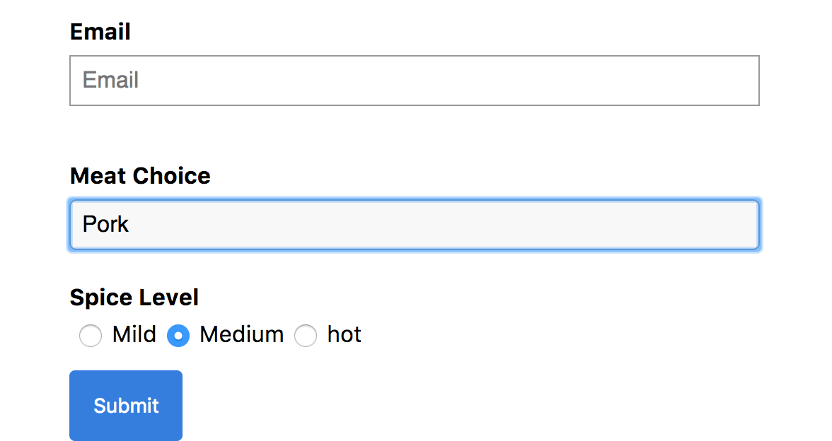
export default Select;Now we can add another Field to our form that takes in our select component and a bunch of options we pass through as props:
src/modules/form/form.component.js
import React from 'react';
import { Field } from 'redux-form';

import Text from '../components/text';
import Select from '../components/select';

export const FormComponent = ({ handleSubmit, onSubmit }) => {
  return (
    <div className="flex flex-column justify-center items-center">
      <h1>My Very own Form</h1>
      <form
        className="w-80"
        onSubmit={handleSubmit(onSubmit)}
      >
        ...
        <Field
          name="meatChoice"
          label="Meat Choice"
          component={Select}
          options={{
            pork: 'Pork',
            beef: 'Beef',
            chicken: 'Chicken'
          }}
        />
...

export default FormComponent;
Making a Custom Radio Input
HTML5 radio inputs are a bit weird. There's no explicit 'radio' tag like there is for 'select', so it's the same as our 'input' tag only with a specified type of 'radio'.
This is how it looks like in normal HTML5:
<form>
  <input type="radio" name="gender" value="male" checked /> Male<br />
  <input type="radio" name="gender" value="female" /> Female<br />
  <input type="radio" name="gender" value="other" /> Other
</form>
So how do we convert that to React/Redux Form? Maybe we could use three separate Field components and make them all of type radio, but that leads to a lot of boilerplate just to render one field. Ideally, we want something like our 'text' input or 'select' input where we feed a single component into the component prop of Field.
We'll use the same pattern as we did in our select component, where we passed in an 'options' prop that we mapped over to render individual snippets of JSX.
Keep in mind that for radio inputs, each input option has to have the same name prop while still maintaining a unique key to satisfy React:
src/modules/components/radio.js
import * as React from "react";
import { Field } from "redux-form";

export const Radio = (props) => {
  if (props && props.input && props.options) {
    const renderRadioButtons = (key, index) => {
      return (
        <label
          className="sans-serif w-100"
          key={`${index}`}
          htmlFor={`${props.input.name}-${index}`}
        >
          <Field
            id={`${props.input.name}`}
            component="input"
            name={props.input.name}
            type="radio"
            value={key}
            className="mh2"
          />
          {props.options[key]}
        </label>
      );
    };
    return (
      <div className="mv3 w-100">
        <div className="b sans-serif pv2 w-100">{props.label}</div>
        <div>
          {props.options && Object.keys(props.options).map(renderRadioButtons)}
        </div>
      </div>
    );
  }
  return <div></div>;
};

export default Radio;
And now we can plop it into our form just like this:
src/modules/form/form.component.js:
<Field
  name="spiceLevel"
  label="Spice Level"
  component={Radio}
  options={{
    mild: "Mild",
    medium: "Medium",
    hot: "hot",
  }}
/>;
Making a Custom Checkbox Little boxes that can be checked or unchecked. Here's how you would implement a basic checkbox:
src/modules/components/checkbox:
import React from "react";
export const Checkbox = (props) => {
  return (
    <div className="flex items-center mv4 w-100">
      <input
        {...props.input}
        className="mr2"
        type="checkbox"
        checked={props.input.value}
      />
      <div className="sans-serif">{props.label}</div>
    </div>
  );
};
export default Checkbox;
src/modules/form/form.component.js
...
<Field
          name="wantsFries"
          label="Would you like fries with that?"
          component={Checkbox}
        />
...
Integrating a Datepicker Component
There are plenty of libraries offering datepickers, many of which expose a single component we can drop in. The tricky part is that these datepicker components often have their own React state and spreading our Field props into these components often ends up not working.
It's okay for the datepicker to have its own internal state to keep track of things like whether to display the UI or not, but we still want to keep the value of the field tracked in Redux state, like the rest of our fields.
Redux Form comes with many built in action creators, one of which can explicitly change the value of a Field. We pass that action creator, change, down through our component as props and use it in combination with a custom handleDateChange event handler to dispatch an action to change the value of the field in Redux every time the date changes.
src/modules/components/datepicker.js
import React from "react";
import moment from "moment";
import { SingleDatePicker } from "react-dates";
import "react-dates/lib/css/_datepicker.css";
export class Datepicker extends React.Component {
  constructor(props) {
    super(props);
    this.state = {
      date: moment(),
      focused: false,
    };
  }
  handleDateChange = (date) => {
    this.setState({ date });
    this.props.change(this.props.input.name, date);
  };
  render() {
    return (
      <div className="mv4 w-100">
        <div className="b sans-serif pv2 w-100">{this.props.label}</div>
        <SingleDatePicker
          date={this.state.date} // momentPropTypes.momentObj or null
          onDateChange={this.handleDateChange} // PropTypes.func.isRequired
          focused={this.state.focused} // PropTypes.bool
          onFocusChange={({ focused }) => this.setState({ focused })} // PropTypes.func.isRequired
          showClearDate={true}
          numberOfMonths={1}
        />
      </div>
    );
  }
}
export default Datepicker;
src/modules/form/form.component.js
import React from 'react';
import { Field } from 'redux-form';
import Text from '../components/text';
import Select from '../components/select';
import Radio from '../components/radio';
import Checkbox from '../components/checkbox';
import Datepicker from '../components/datepicker';
export const FormComponent = ({ handleSubmit, onSubmit, formValues, change }) => {
  return (
    <div className="flex flex-column justify-center items-center">
      <h1>My Very own Form</h1>
      <form
        className="w-80"
        onSubmit={handleSubmit(onSubmit)}
      >
        ...
        <Field
          name="orderDate"
          label="Order Date"
          component={Datepicker}
          change={change}
        />
        ...
export default FormComponent;
Form Selectors and Field-dependent Values
Let's say you needed to create a dynamic form in which you wanted to show a field, but only if the user filled out a previous field prior with a certain value. Maybe we only want to show a checkbox if the user has selected 'hot' as a value in our radio field.
Using the getFormValues selector, we can select form values and use some vanilla JavaScript ternary logic to express our form output:
src/modules/form/form.container.js:
import React from "react";
import { connect } from "react-redux";
import { reduxForm, getFormValues } from "redux-form";
import FormComponent from "./form.component";
export const FormContainer = (props) => {
const submitForm = (formValues) => {
console.log("submitting Form: ", formValues);
};
return (
<FormComponent
formValues={props.formValues}
change={props.change}
onSubmit={submitForm}
handleSubmit={props.handleSubmit}
/>
);
};
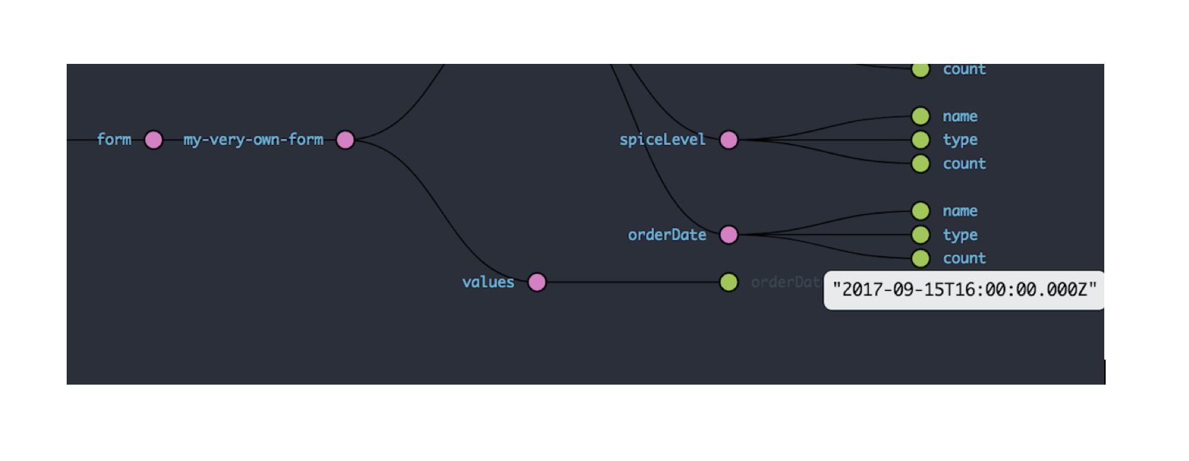
const mapStateToProps = (state) => ({
formValues: getFormValues("my-very-own-form")(state),
});
const formConfiguration = {
form: "my-very-own-form",
};
export default connect(mapStateToProps)(
reduxForm(formConfiguration)(FormContainer),
);src/modules/form/form.component
import React from "react";
import { Field } from "redux-form";
import Text from "../components/text";
import Select from "../components/select";
import Radio from "../components/radio";
import Checkbox from "../components/checkbox";
export const FormComponent = ({ handleSubmit, onSubmit, formValues }) => {
return (
<div className="flex flex-column justify-center items-center">
<h1>My Very own Form</h1>
<form className="w-80" onSubmit={handleSubmit(onSubmit)}>
...
<Field
name="spiceLevel"
label="Spice Level"
component={Radio}
options={{
mild: "Mild",
medium: "Medium",
hot: "hot",
}}
/>
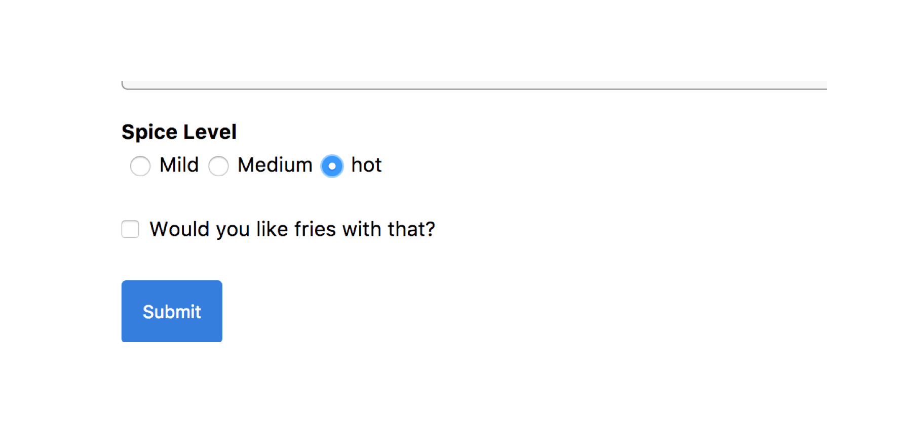
{formValues && formValues.spiceLevel === "hot" ? (
<Field
name="wantsFries"
label="Would you like fries with that?"
component={Checkbox}
/>
) : (
""
)}
<button
type="submit"
className="link br2 bg-blue white dim pa3 f6 sans-serif b--blue ba"
>
Submit
</button>
</form>
</div>
);
};
export default FormComponent;And now, the 'wantsFries' field will only show if the user selects 'hot' for the 'spiceLevel' field:
A little thing to note with these fields is that the values will remain in Redux state even if they are not displayed. If you checked 'wantsFries', and then clicked 'medium' on 'spiceLevel', the 'wantsFries' field would disappear but the value would still stick in state.
This can be fixed with some plain old React/Redux/JS patterns by manually setting the value in the reducer as we want at certain lifecycle methods or other events, as we did in the datepicker.
Validation
I've always liked forms that validate on every key press rather than having to fill out everything, hit the submit button, wait for the response, and then go hunting for all the possible errors. You can do both in Redux Form, but this section will focus on real-time client-side validation.
Redux Form gives you the option of passing in all of the validation functions into the Redux Form configuration object or passing validation functions to individual Field components. I prefer the second method more because you get finer control of your validation process, and I don't like doing much with configuration.
To create a validator, make a function that takes in 'value' (passes the value of the field on every update), and returns an error depending on the logic you write. Validators also get passed values of other fields and props too, in case you ever need to write validation logic requiring more data on the form and fields. Let's make a simple required validator that returns an error if there is no value:
src/modules/form/form.validators.js
// validate : (value, allValues, props) => error [optional] #
export const required = (value) => {
  if (!value) {
    return "This field is required!";
  }
};
And then you feed it into your Field component as another prop:
src/modules/form/form.component.js
import { required } from './form.validators'
…
  <Field
          name="firstName"
          label="First Named"
          component={Text}
          validate={required}
        />
...
You could also pass in an array of validators if you wanted more than one. Inside the component, you're going to want to create some logic as to what to do or display when an error on the field pops up:
src/modules/components/text.js
import React from "react";
export const Text = (props) => {
  return (
    <div className="mv4 w-100">
      <div className="b sans-serif pv2 w-100">{props.label}</div>
      <input
        {...props.input}
        placeholder={props.label}
        type="text"
        className="pa2 ba b--black-40 w-100"
      />
      {props.meta &&
        props.meta.error &&
        props.meta.touched(
          <div className="sans-serif red">{props.meta.error}</div>,
        )}
    </div>
  );
};
export default Text;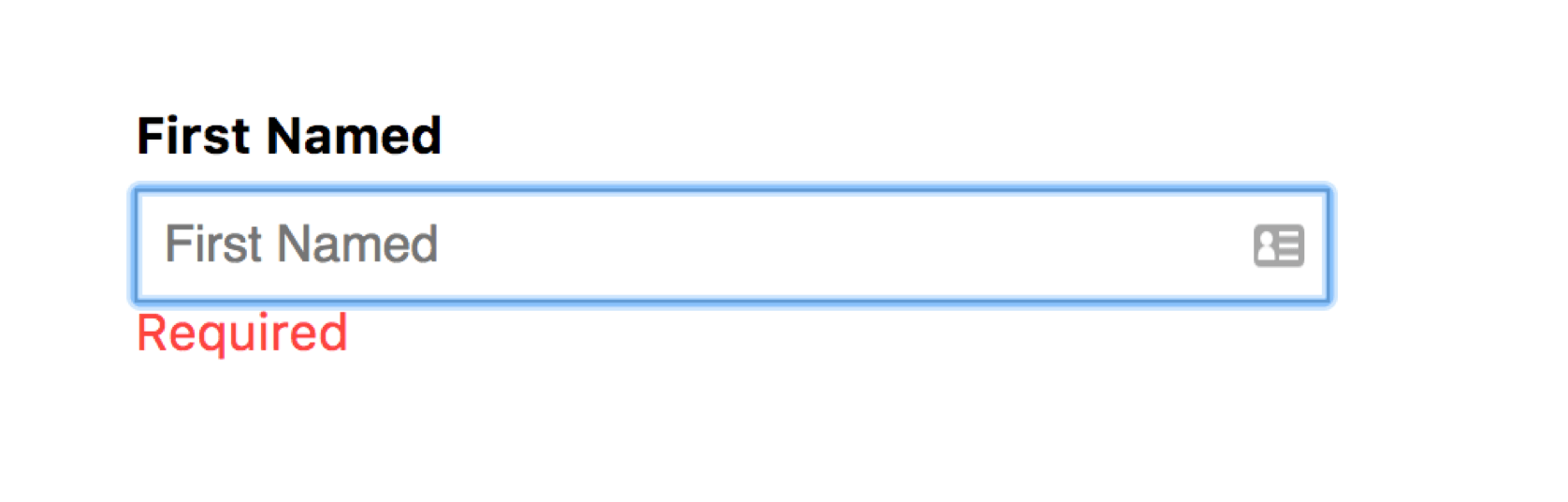
Submission
You can do a lot of things upon submit because it's all just plain actions and reducers. All the patterns you're used to in React and Redux can be applied here. You can integrate form submission with redux-sagas, redux-observables, thunks and promises, or whatever you desire. In our example, we used the built-in handleSubmit helper that takes an onSubmit prop, which we defined ourselves.
What handleSubmit does is it runs validation on the form and, if all fields are valid, it calls onSubmit with the contents of the form data. What onSubmit does is completely up to you.
There may be instances where you need more flexibility in form submission, and in such cases I recommend throwing out handleSubmit and using the built-in action creators and selectors to dispatch actions to start form submission, run validation, and perform asynchronous side effects, all of which can be defined by yourself.
We made form widgets, learned how to use some built-in action creators and selectors, and made a form with Redux Form version 7.
I hope you can see how robust Redux Form can be and how nice it plays with standard React and Redux patterns. Next time you need to integrate a bunch of forms, give Redux Form a shot.
If you happen to have questions, feedback, feature requests or anything at all, please don't hesitate to reach out.
Kyle Truong is a software developer who writes about new tools and concepts he comes across.
Check out Kyle's other articles.